The 10 Ugliest Charizard Cards of All Time
Charizard sells whatever is printed on it, which is exactly why some of the art is this bad. Ten misses, and the house decisions behind them.
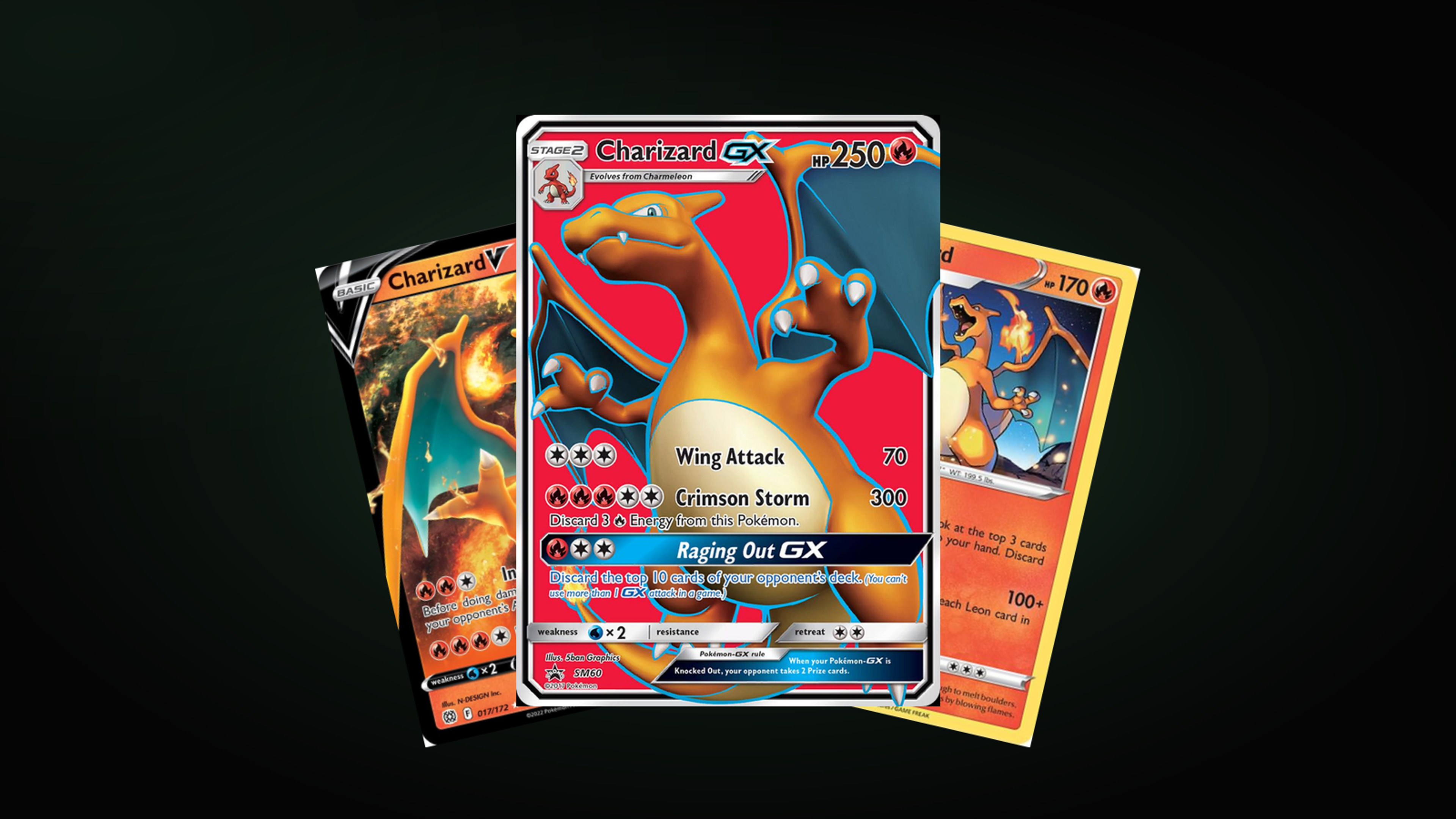
Charizard sells no matter what is printed on the card. That is the whole reason a list like this is possible: an artist can miss completely, and the card still moves, because the name on it does the work.
Ten Charizards that did not land. None of this is aimed at the illustrators, who were mostly working inside a house style they did not choose. The interesting part is that the misses cluster, and the clusters have dates.
10. Charizard GX SM60
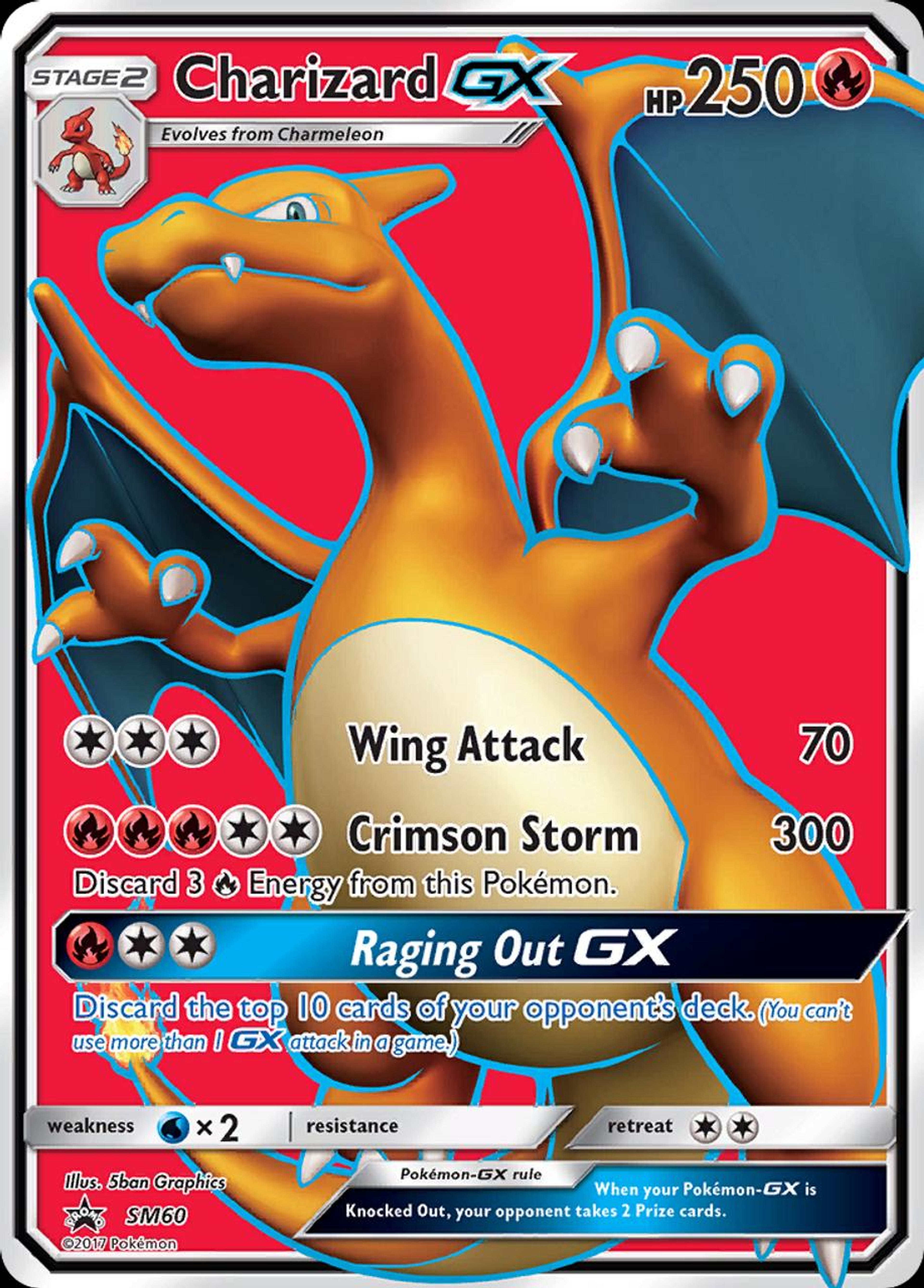
A promo, and it looks like one. Flat colour, a generic pose, and a background that is two colours meeting in the middle because something had to be there.
9. Charizard V 17/172
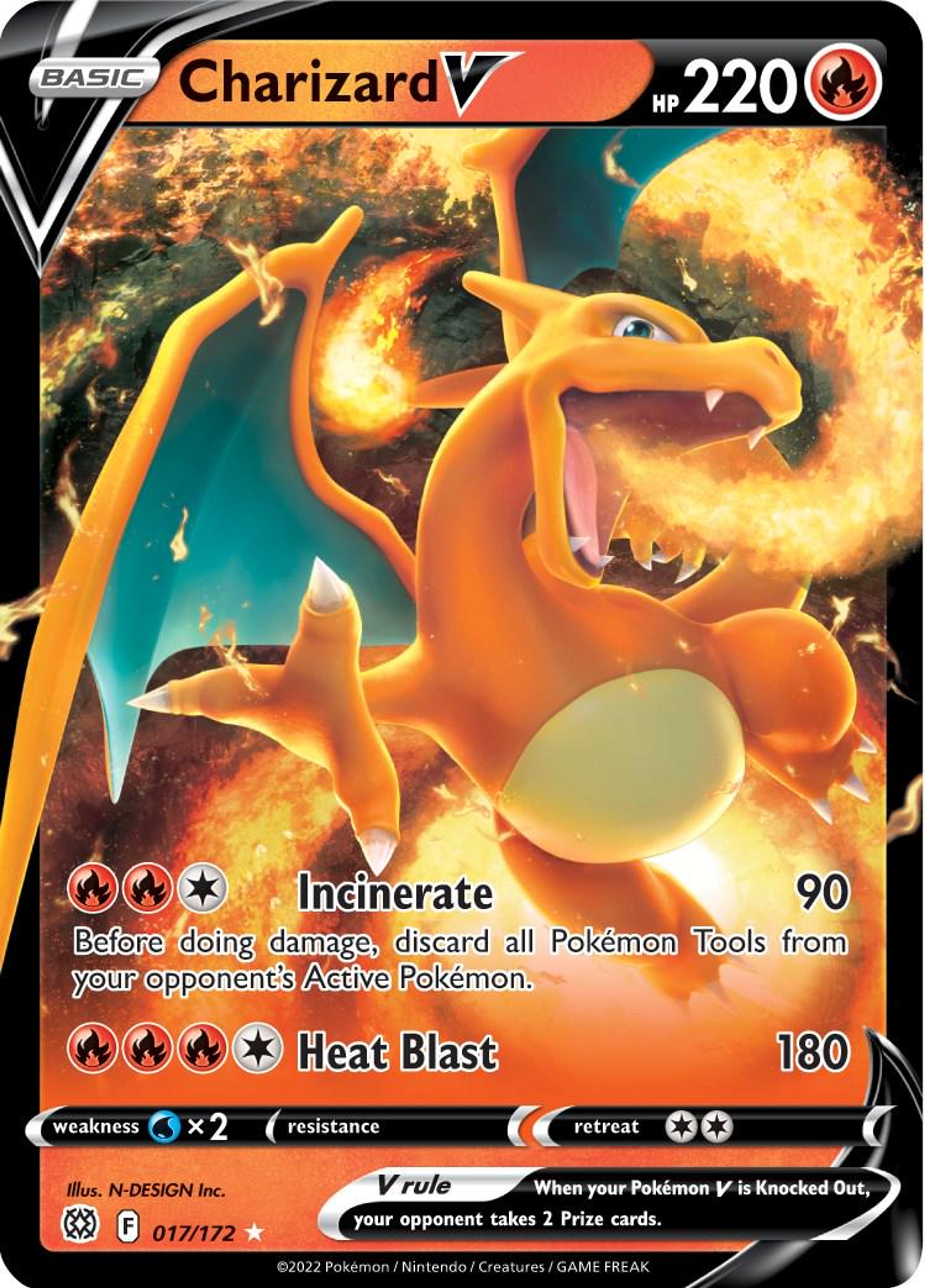
The cleanest of the three 3D renders on this list, which is not a compliment. It is competent, symmetrical, and completely without a point of view. Nothing is happening.
8. Charizard 25/185
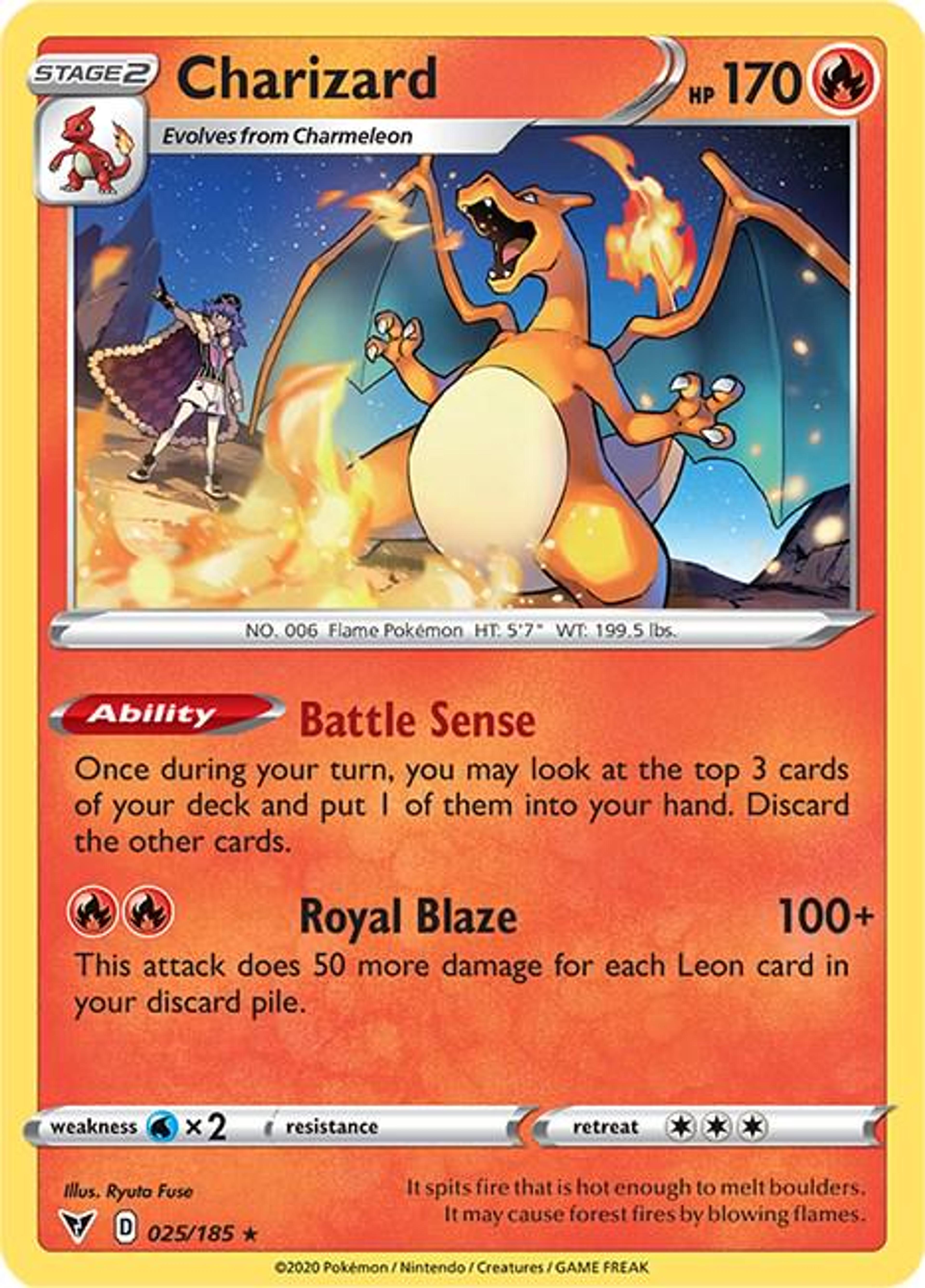
Same rendering problem, plus a human. Leon is drawn in one style and Charizard in another, and standing them next to each other makes both look wrong.
7. Charizard 10/078, Pokémon GO
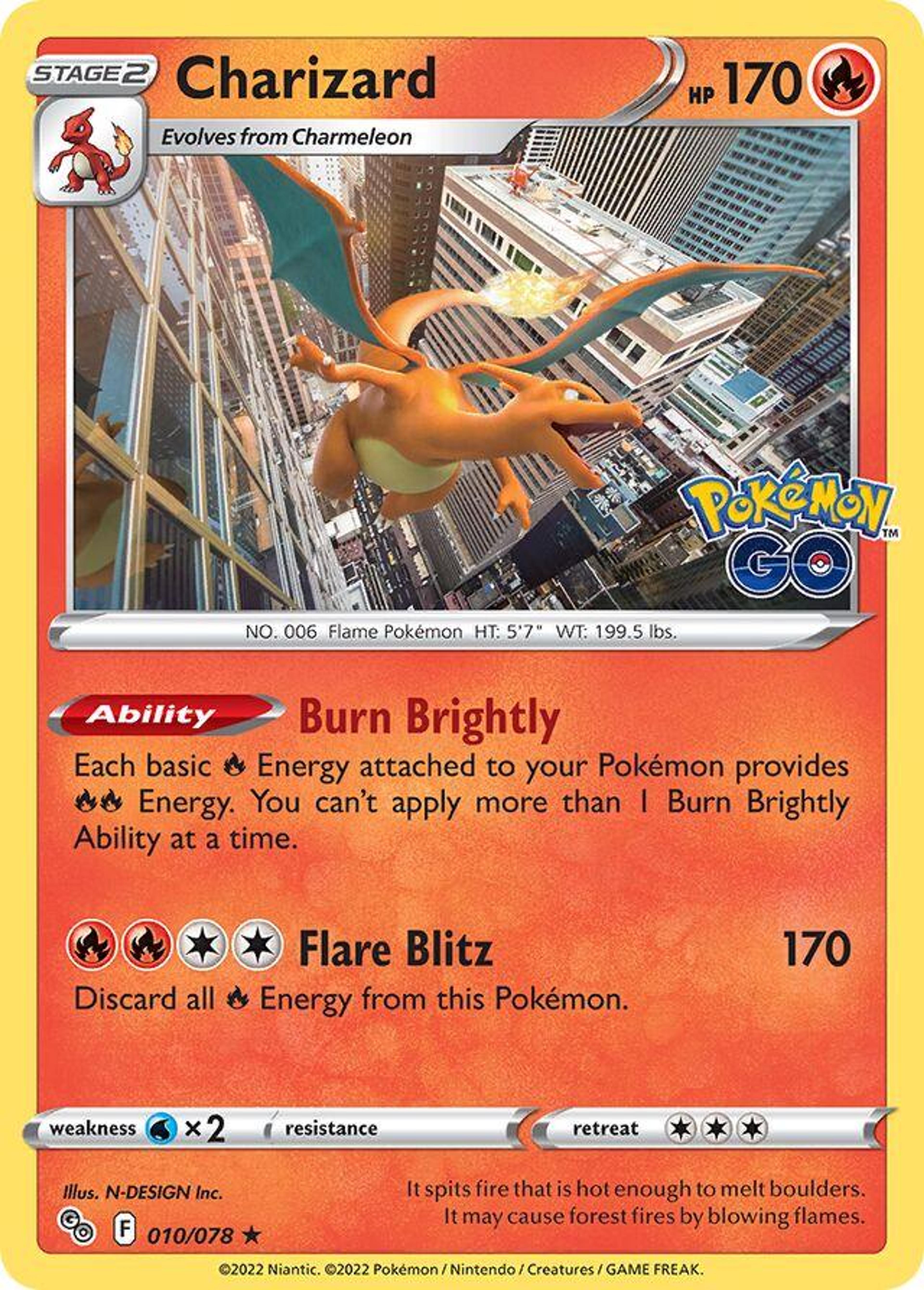
This is the moment the card game started rendering instead of drawing. The Charizard is a 3D model, the city underneath is nearly photographic, and the two never agree on what kind of image they are in.
6. Radiant Charizard 20/159
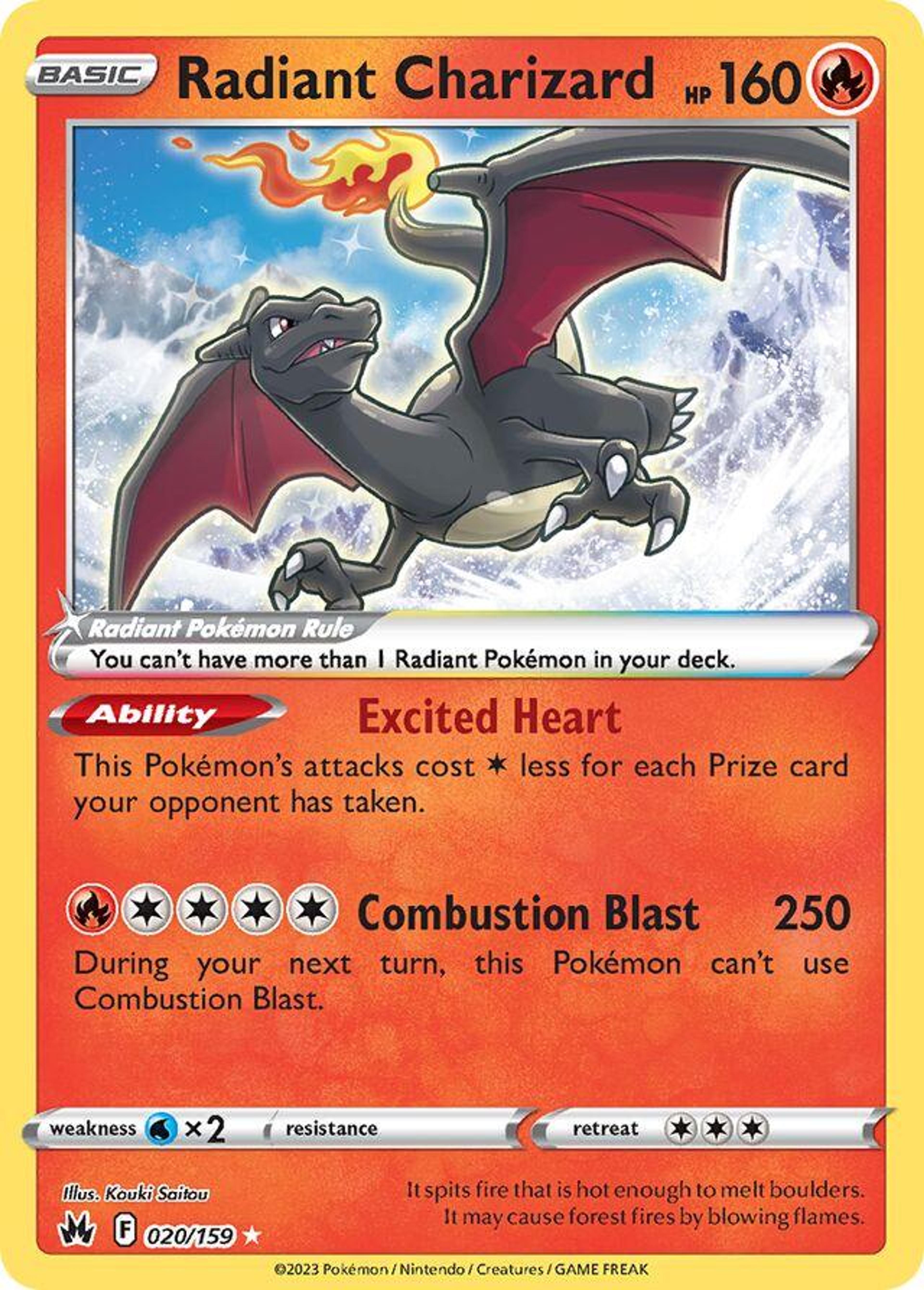
A black Charizard on a white background is a bold call, and on a phone screen it mostly reads as a silhouette. The Radiant treatment gave a handful of Pokémon a recoloured shiny look, and Charizard is the one where the recolour lost the most.
5. Charizard EX 11/106

Cropped so close that the Pokémon stops being a Pokémon and becomes a texture. You can count the scales and you cannot tell what it is doing.
4. M Charizard EX 69/106
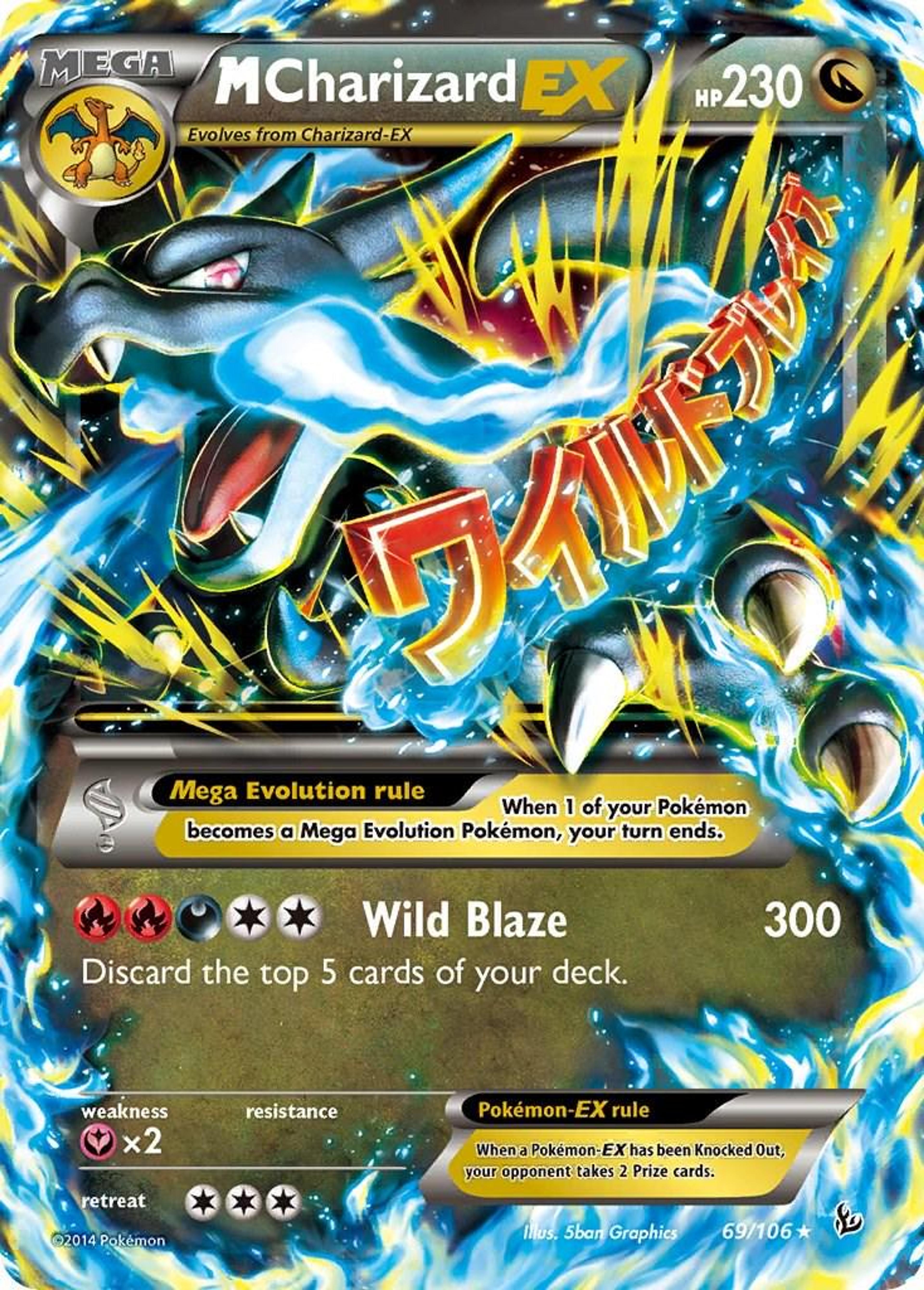
There is a good card in here somewhere. The problem is that the katakana, the energy streaks, the lightning and the dragon are all fighting for the same space, and none of them wins.
3. Charizard G 20/147

The first of two Team Galactic Charizards, and the worse of them, because the Charizard is smaller and the background is a flat dark blue. Put it beside number two and you are not looking at two bad drawings, you are looking at one bad template used twice.
2. Charizard G LV.X 143/147
This is Team Galactic's Charizard, and the era's rule was that a trainer's face got pasted into a circle in the corner of the art. It turns every card into a passport photo with a dragon behind it.
The palette does the rest. Brown, grey and a dull orange, on a card that is supposed to be about fire.
1. Charizard, Expedition 40/165
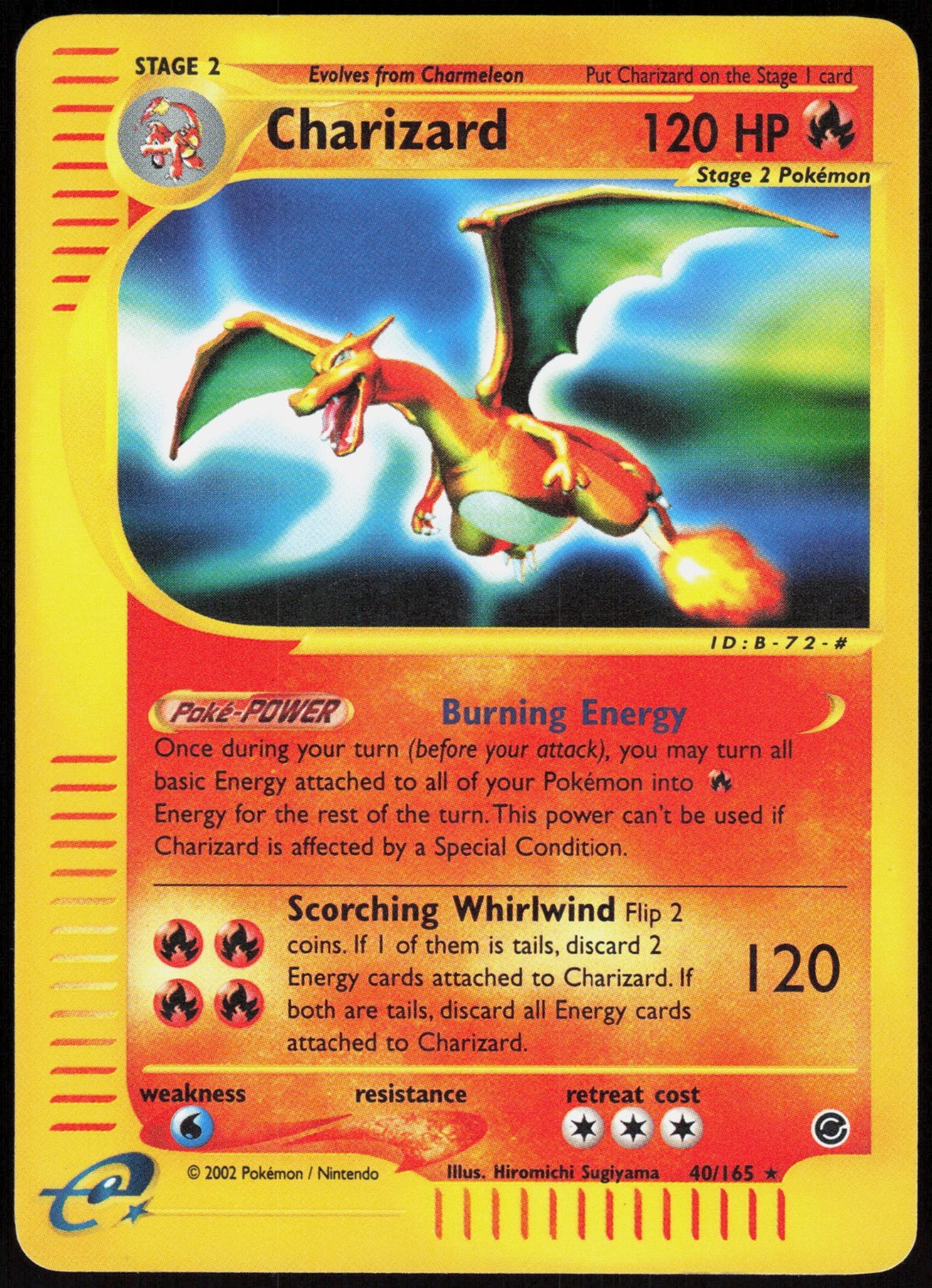
The wings are the problem. They are spread flat and stiff, closer to a kite than to an animal, and the pale card does nothing to help. The dotted strip running down the left edge is the e-Reader code, a format that lasted about two years and left every card of the era looking like it had a barcode stapled to it.
What the misses have in common
Three of these ten are 3D renders, and they arrive together in the same few years. Two more come from the era that pasted a trainer's portrait into the corner of every card. That is five out of ten explained not by a bad artist but by a house decision that aged badly.
“Charizard does not need the art to be good. That is exactly why some of it is not.”
The commercial lesson underneath the joke is real: on a card this famous, demand comes from the name, so the artwork is the one variable nobody is forced to get right.
For the opposite case, where the illustration is the entire reason the card is wanted, see the most amazing Pokémon cards ever printed.
Stakd tracks what your Charizards are actually worth, including the ones you would rather not look at.
Track what your collection is really worth
Stakd turns your cards, Funko Pops and LEGO sets into a valued portfolio, with AI grading, live market prices and profit tracking.
Download StakdKeep reading
Card art & culture
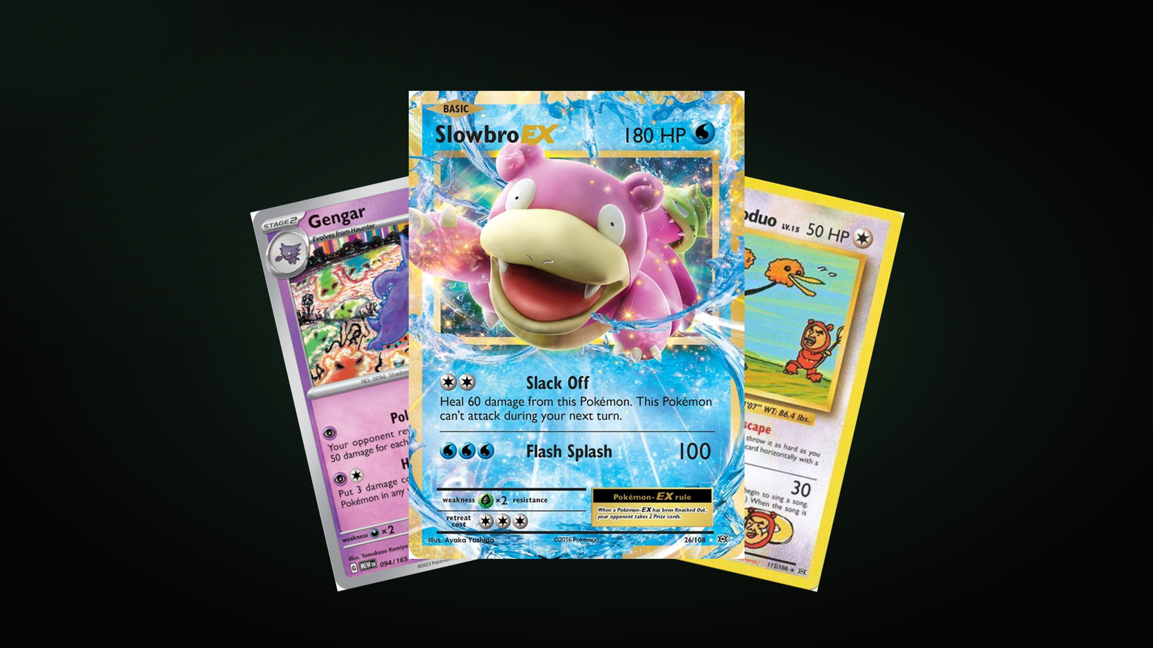
The 15 Goofiest Pokémon Cards of All Time
Fifteen cards that gave up on looking powerful. The same artist keeps appearing, and so do the same three Pokémon families.
· 4 min read
Card art & culture
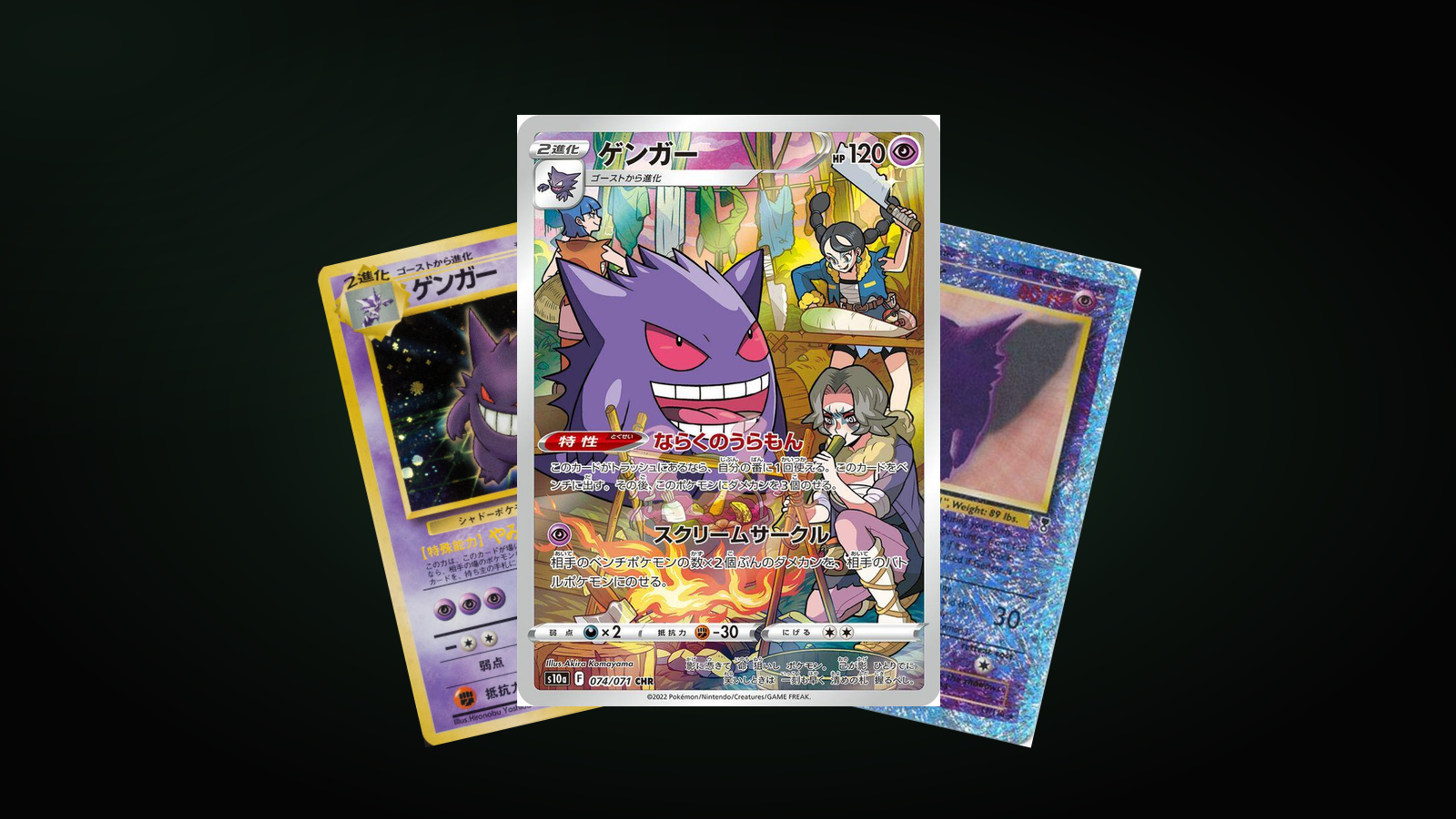
The 10 Most Iconic Gengar Cards of All Time
Thirty years of Gengar, from a Gym-era Sugimori classic to a 2026 Mega, and what each card says about the era that printed it.
· 3 min read
Card art & culture
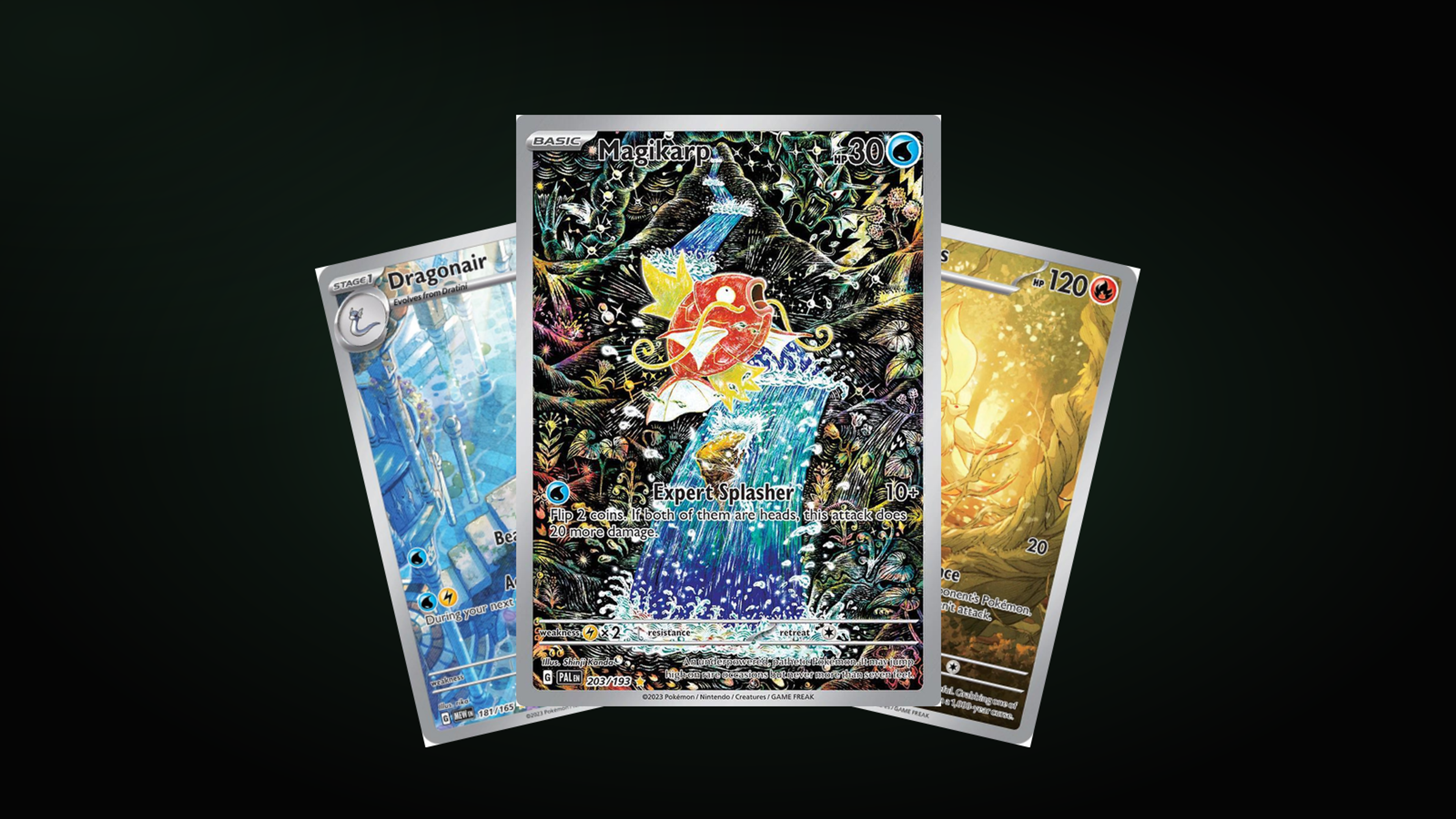
The Most Amazing Pokémon Cards of All Time
Magikarp 203/193, Ancient Mew, a Charizard mid-fight: the cards that earned a place beyond their own set, and what each one proves about card art.
· 5 min read