The Most Amazing Pokémon Cards of All Time
Magikarp 203/193, Ancient Mew, a Charizard mid-fight: the cards that earned a place beyond their own set, and what each one proves about card art.
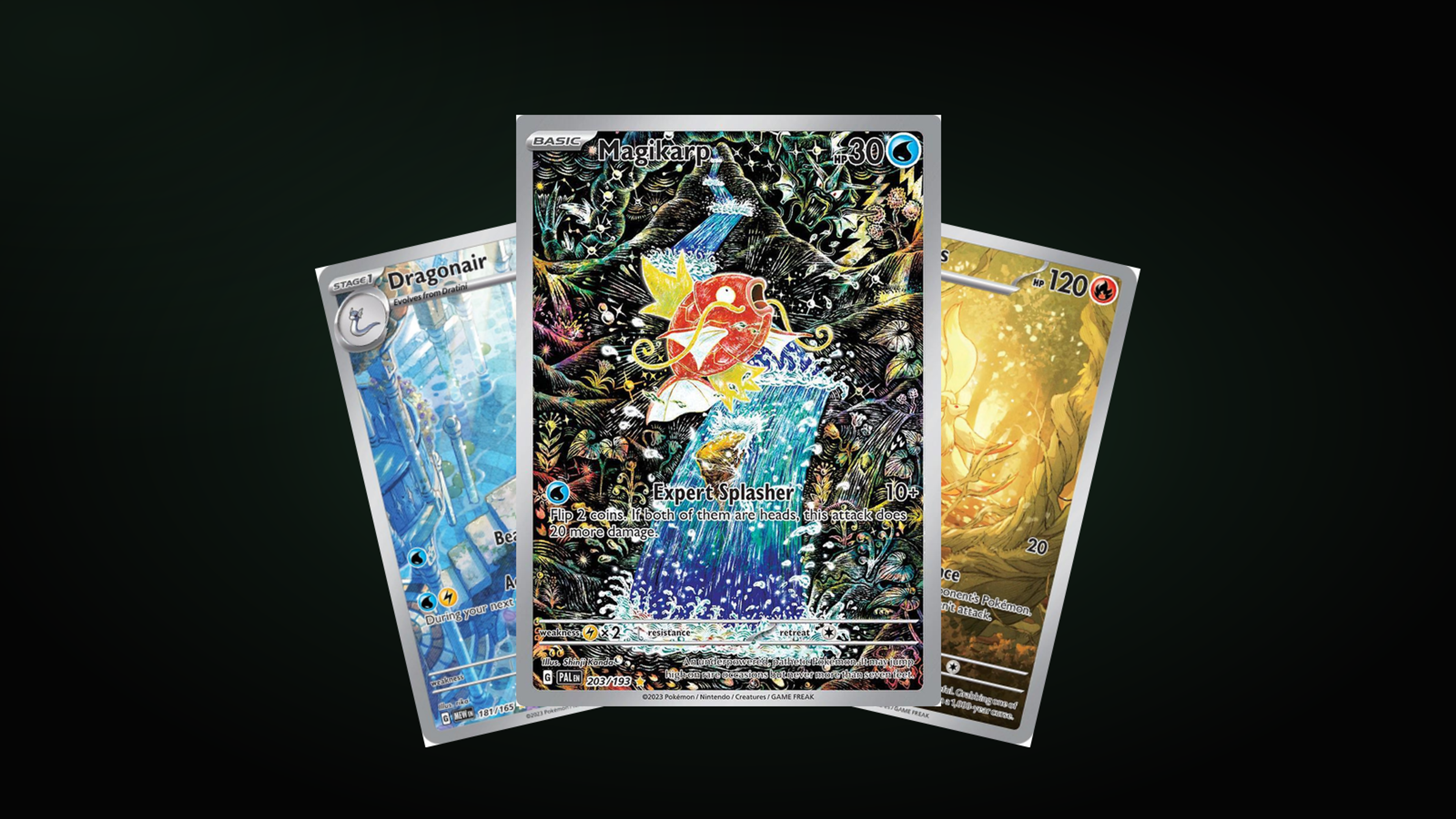
Some Pokémon cards are collected for what they do in a deck. A much smaller group is collected for what they look like. Cards people frame, chase for years, and recognise instantly from across a room.
These are the ones that made the cut, and what each of them proves about card art.
Look at the number before you look at anything else
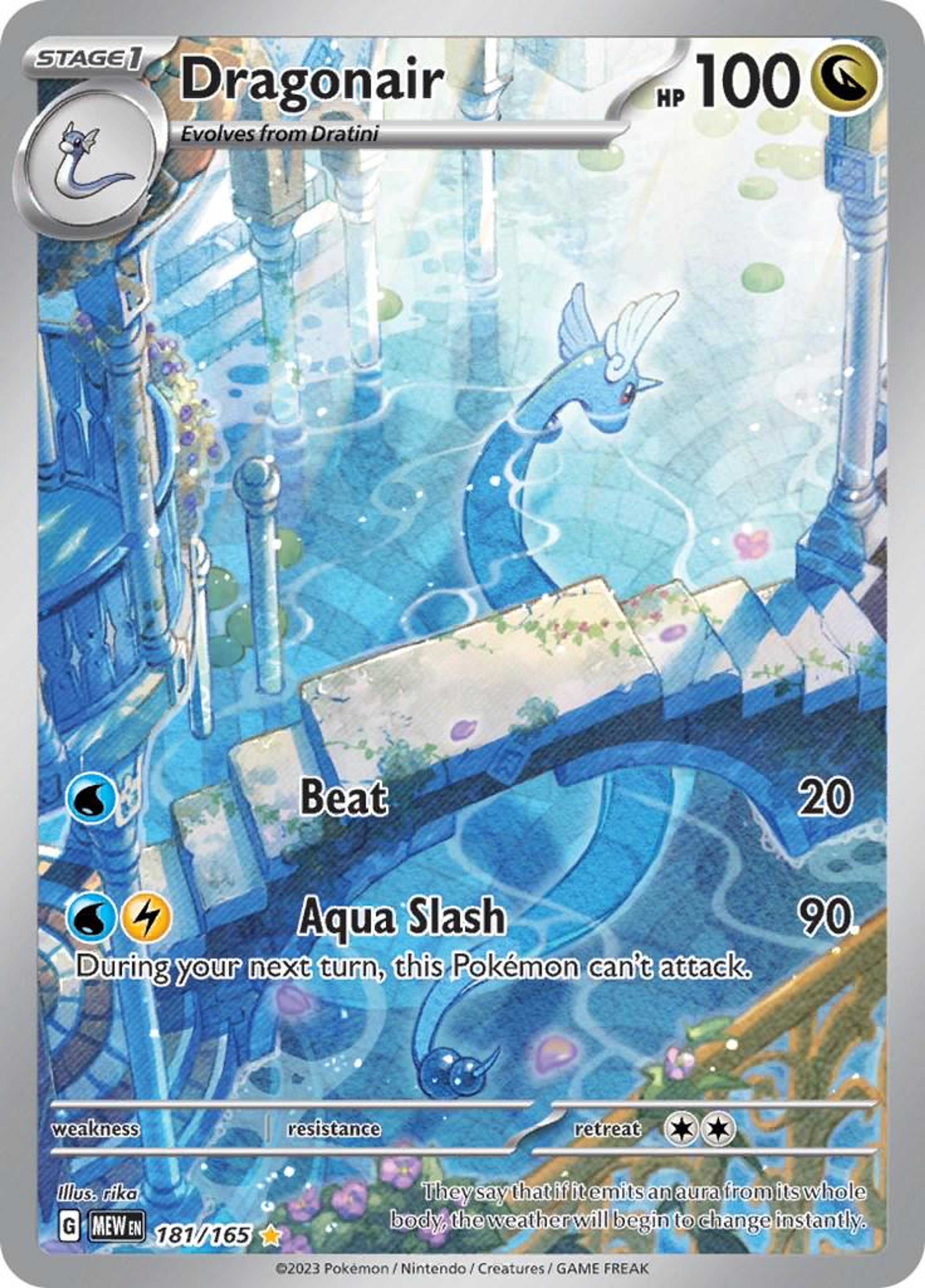
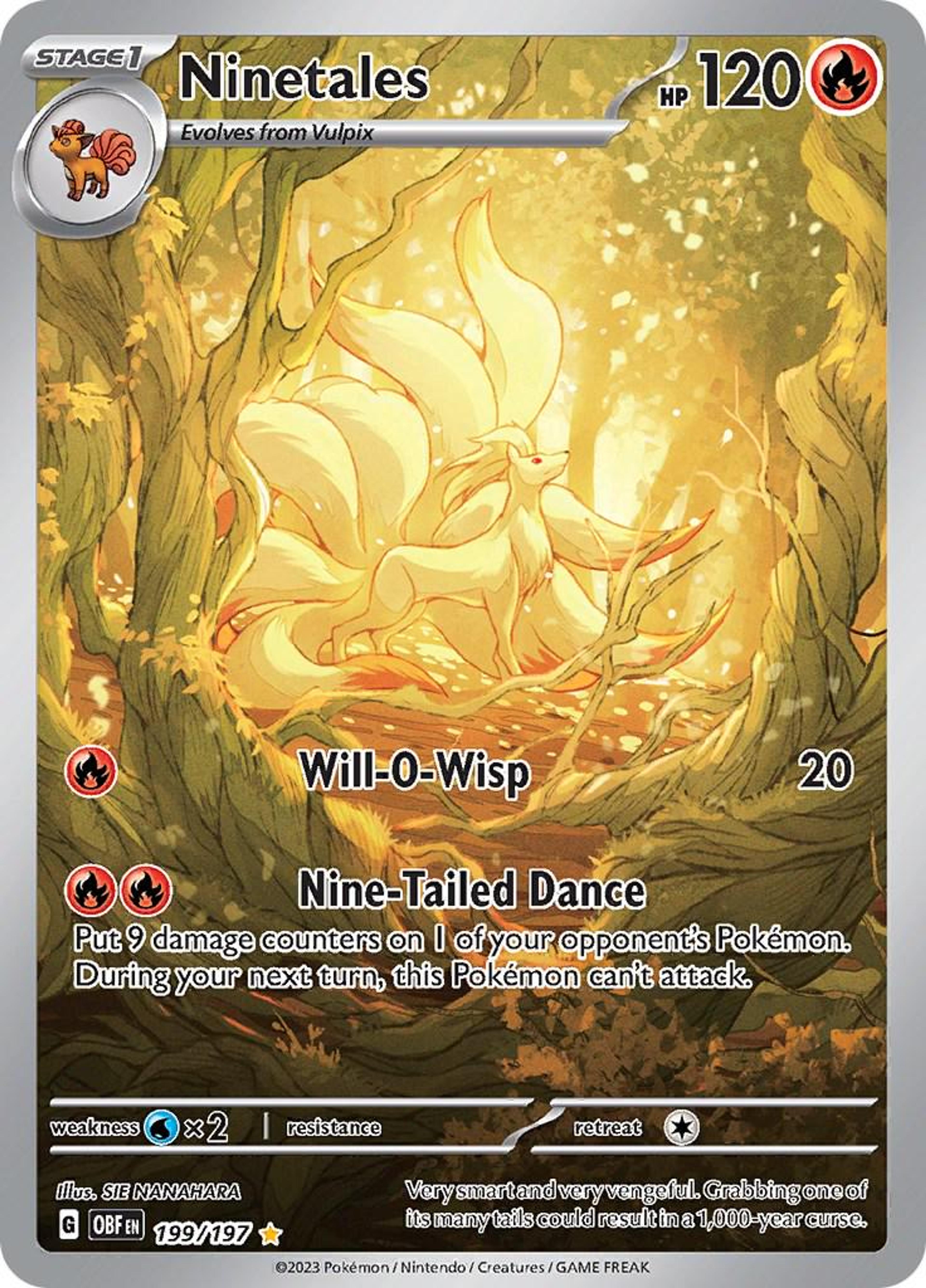
Magikarp 203/193. Dragonair 181/165. Ninetales 199/197. Wailord 162/159. Frogadier 089/086.
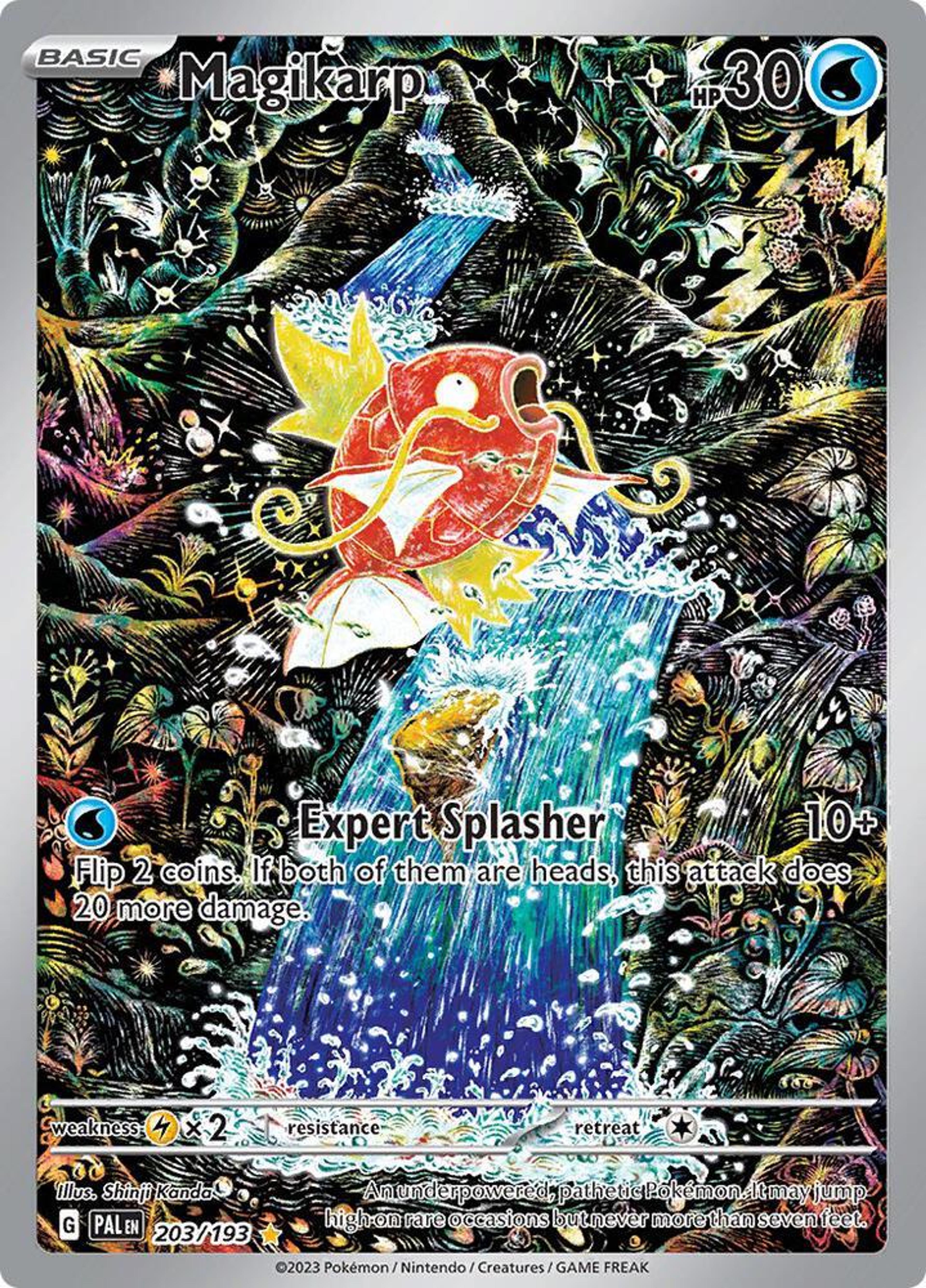
Every one of those numbers is larger than the set it belongs to. That is not a misprint, it is the marker of a card that exists beyond the set, past the last numbered slot, printed because the artwork earned its own place rather than because the game needed the card.
Once you notice it, you cannot stop noticing it. The number itself tells you the card was made for looking at.
When the Pokémon stops being the subject
The Magikarp by Shinji Kanda is the clearest example in the set. The fish is small, orange, and roughly in the middle, and everything else is a dense black world of waterfalls, mushrooms, insects and plants drawn in coloured line work, packed edge to edge. You spend longer looking at the background than at the Pokémon.
rika's Dragonair does the same thing with the opposite palette: flooded blue ruins, columns half-submerged, light coming through from above, and the Dragonair curled through the architecture like it lives there. Sie Nanahara's Ninetales is a corridor of golden trees where the tails and the light are the same colour.
Katsunori Sato's Wailord is the funniest use of the trick: the whale is simply too big for the frame, standing vertically in a reef at sunset with a boat on the surface for scale. The joke and the beauty are the same idea.
Susumu Maeya's Frogadier is the one that gets movement right: the frog is caught mid-stride across a breaking wave, water sheeting off it, the whole card tilted into the direction it is heading. Most action cards freeze a pose. This one keeps going.
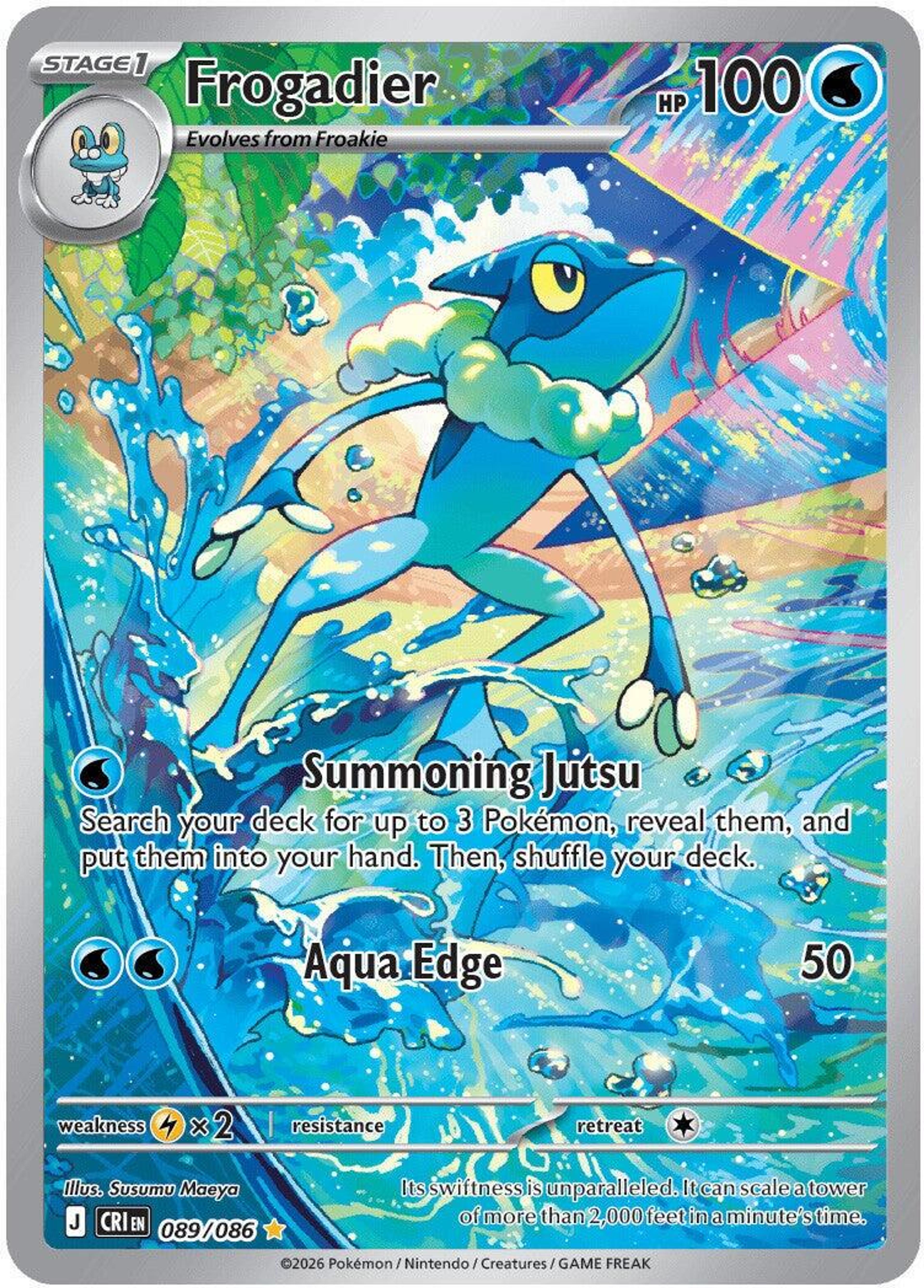
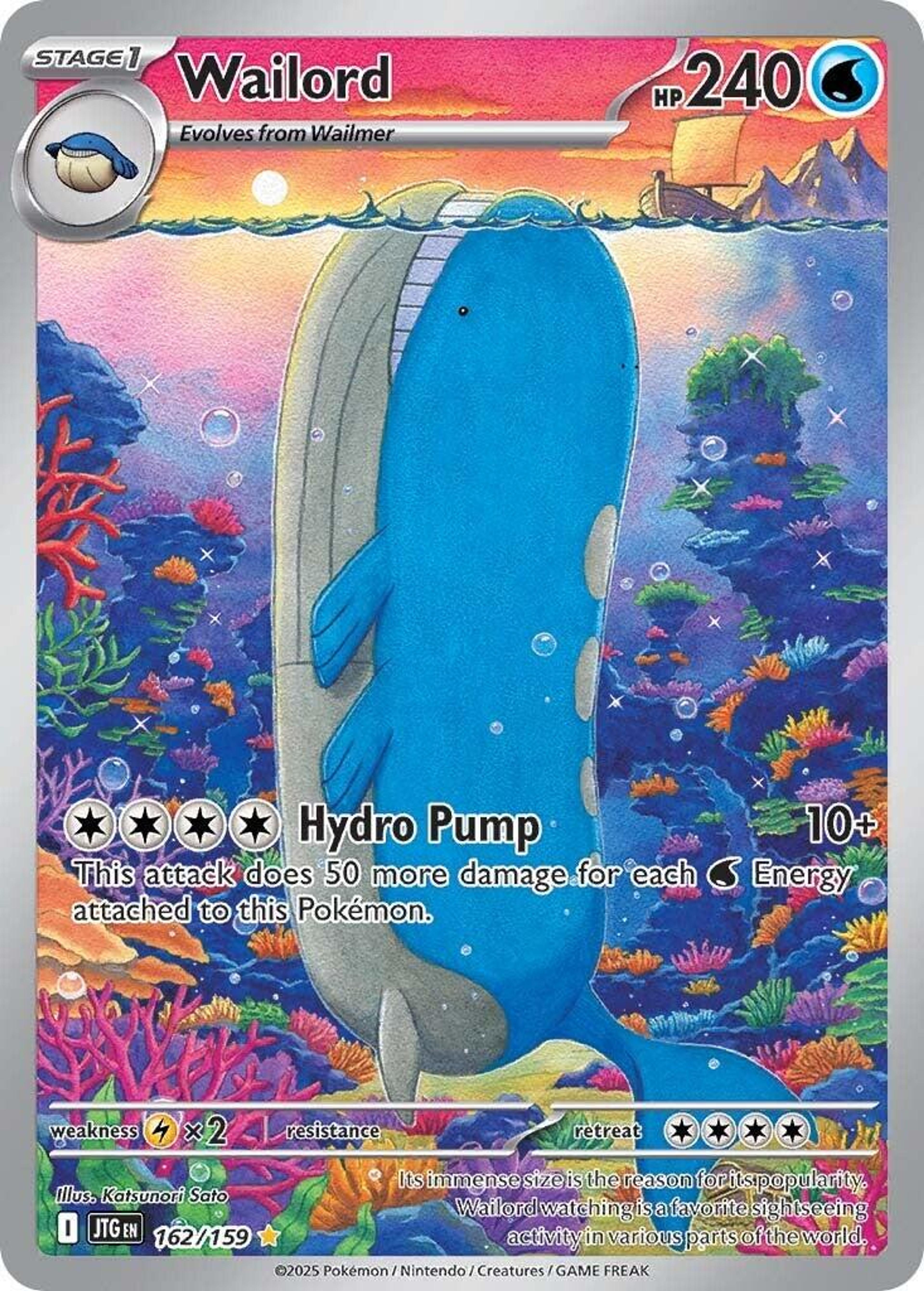
“The best modern card art is not a portrait. It is a place, with a Pokémon in it.”
When the card tells a story
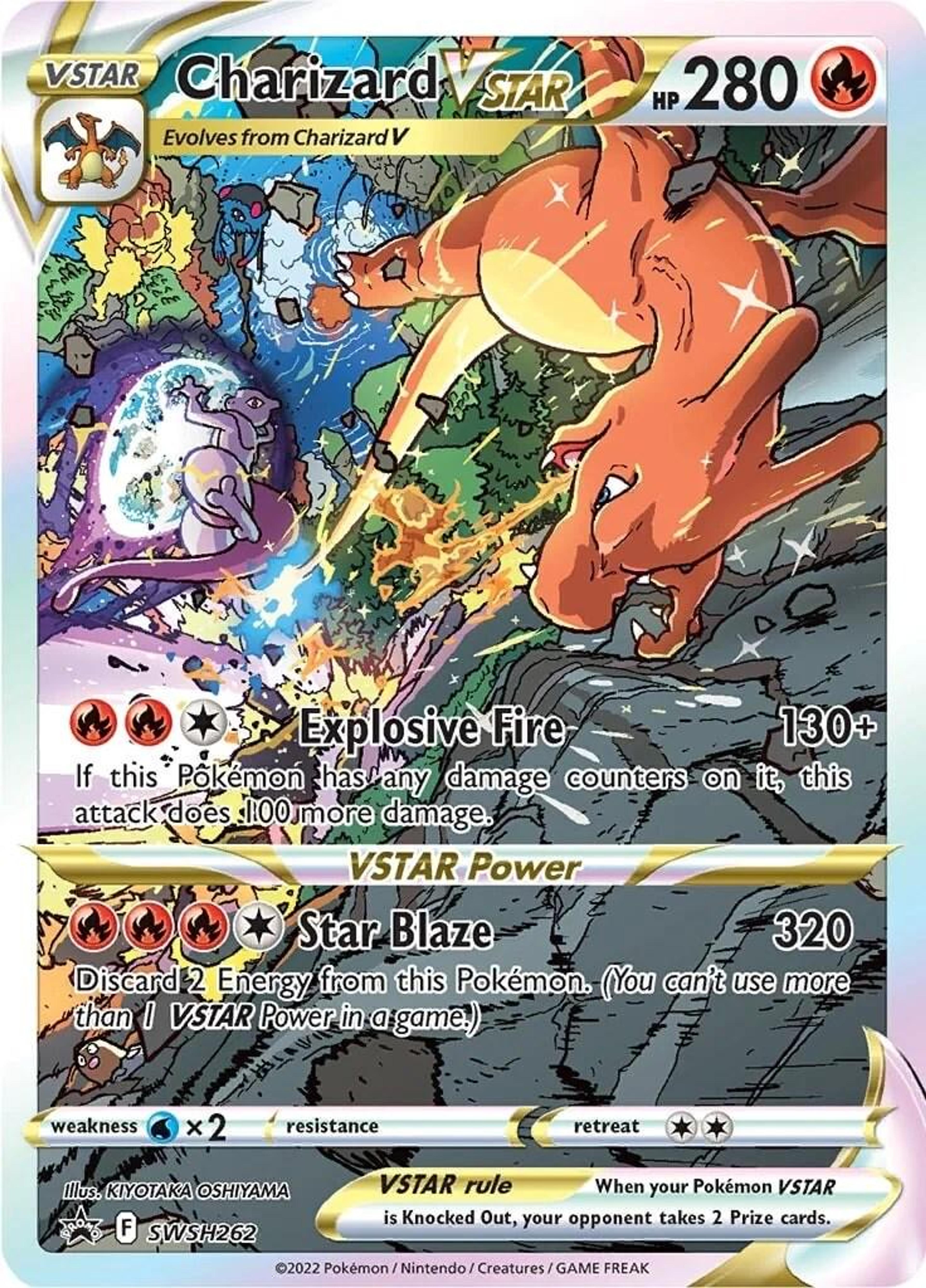
Kiyotaka Oshiyama's Charizard VSTAR is a fight. Charizard on the right, mid-lunge, claws out; Mewtwo on the left inside a shield of psychic energy; rocks and fire between them. It is a frame from a film that does not exist, and it is doing something no static portrait can.
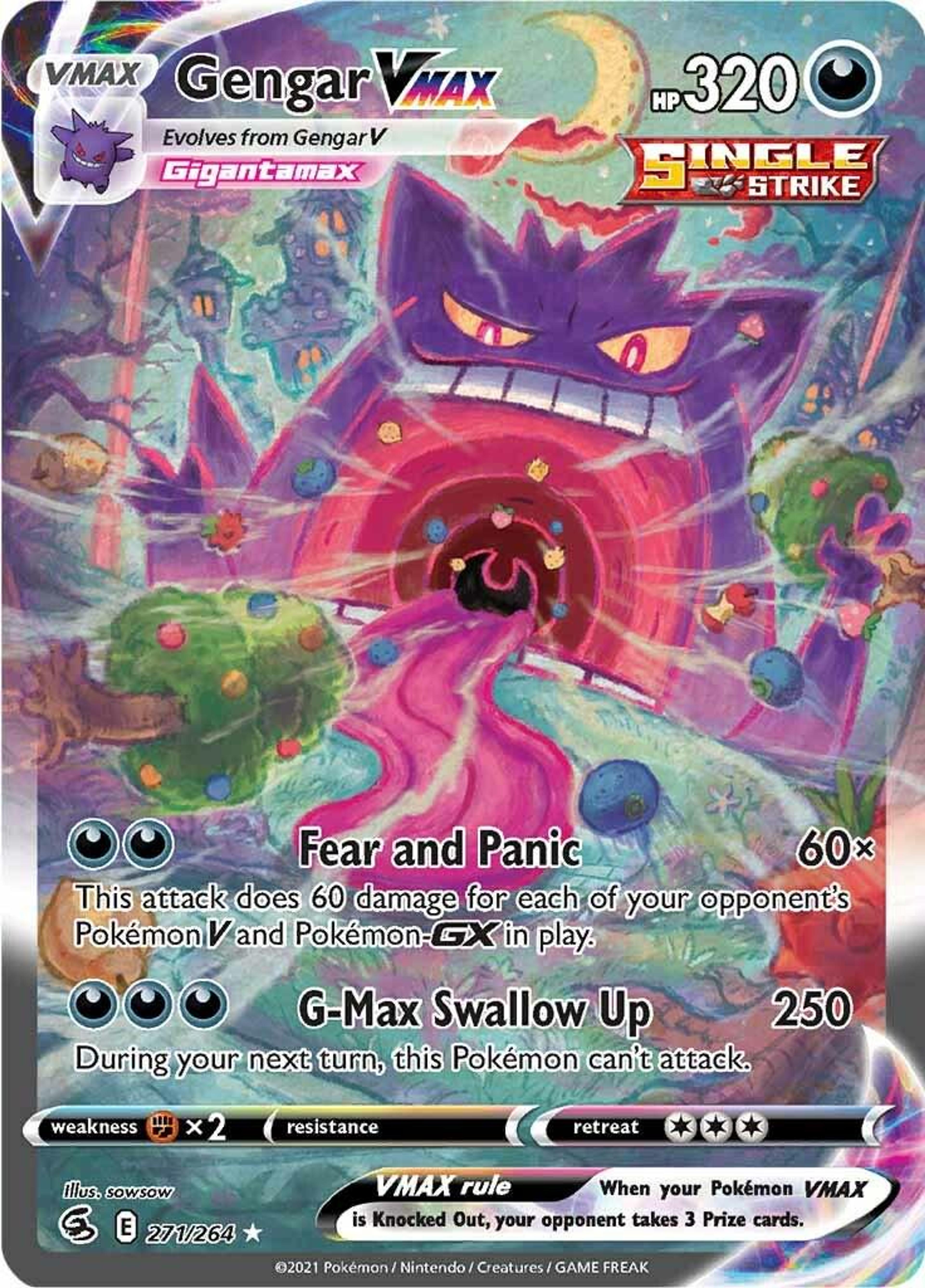
sowsow's Gengar VMAX goes the other way entirely: a pastel storybook landscape with a giant Gengar grinning behind it and a swirling pink void swallowing the road. It should not work. It works because the sweetness makes the menace worse.
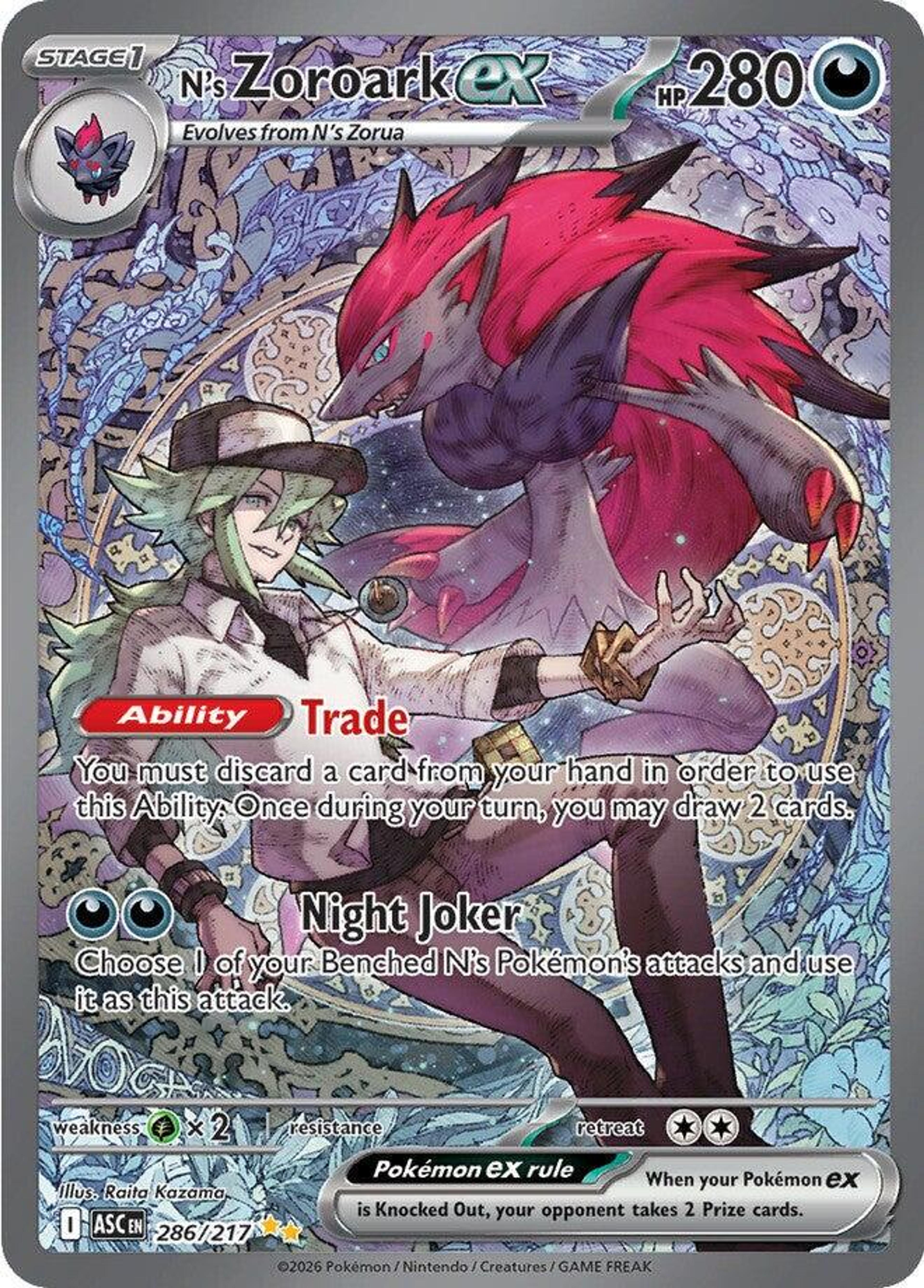
Raita Kazama's N's Zoroark ex puts a human in the frame, which the card game does rarely and usually badly. Here N and Zoroark share the same pose and the same background of dense ornamental pattern, and the card reads as a portrait of a pair rather than a creature with a person attached.
When the art comes from somewhere else entirely
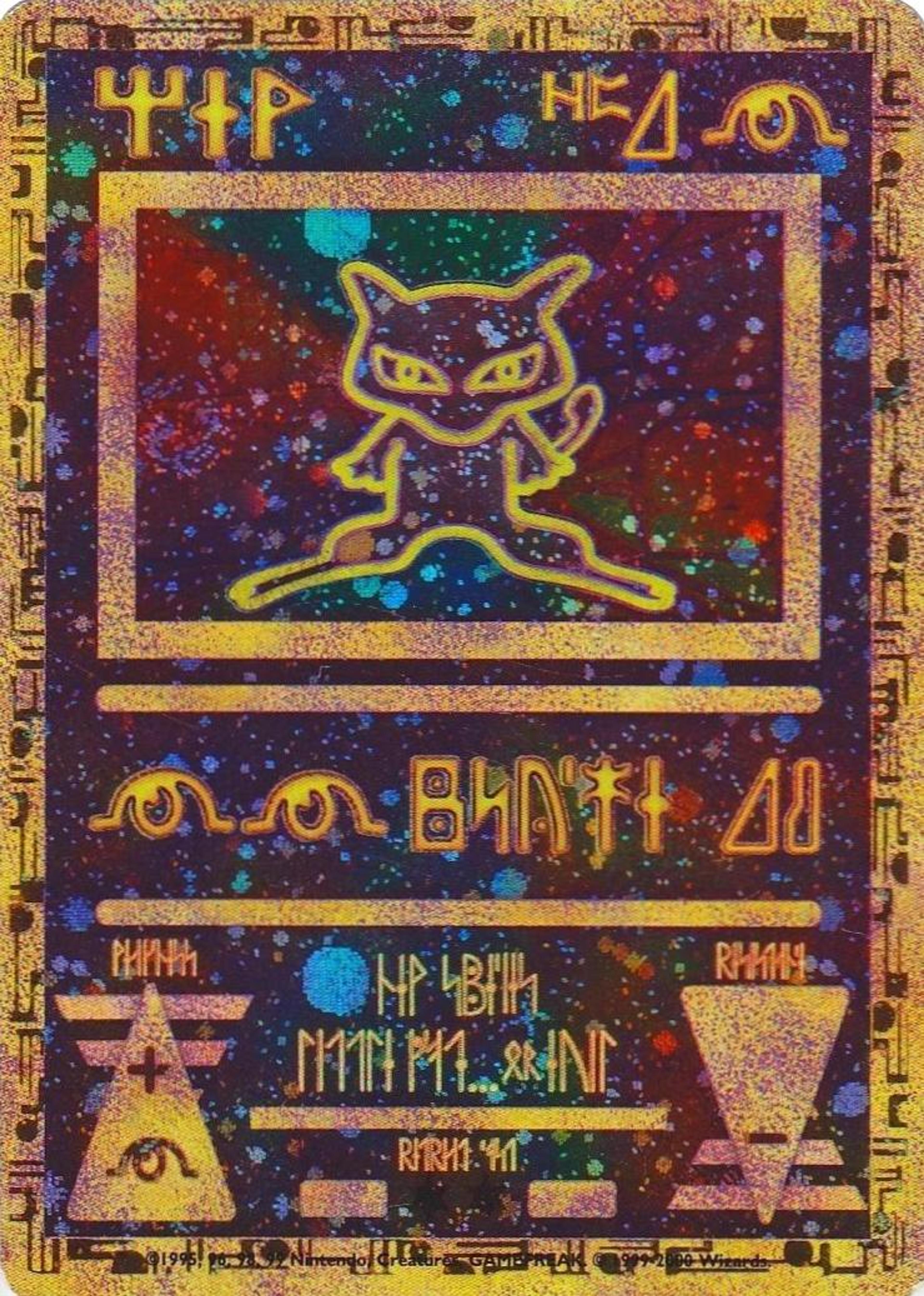
Ancient Mew is still the strangest card ever printed. A movie promo whose entire text is a runic alphabet you cannot read, with a gold-outlined Mew floating on a starfield. It does not tell you its HP, its attacks or its name in any language you speak, and people have wanted it for twenty-five years.
It is the purest proof of the argument: strip out every functional element of a card and enough is left to make people want it.
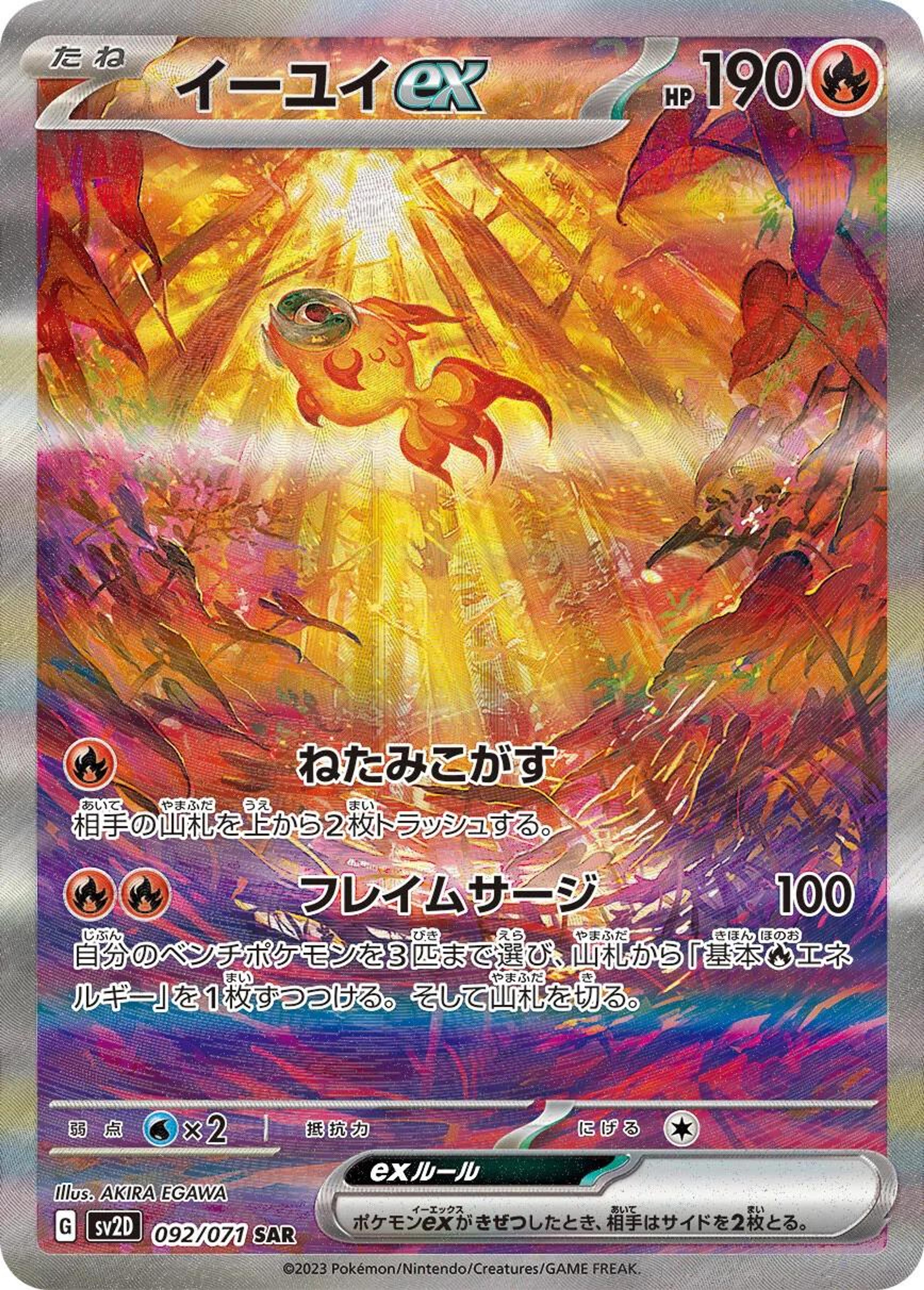
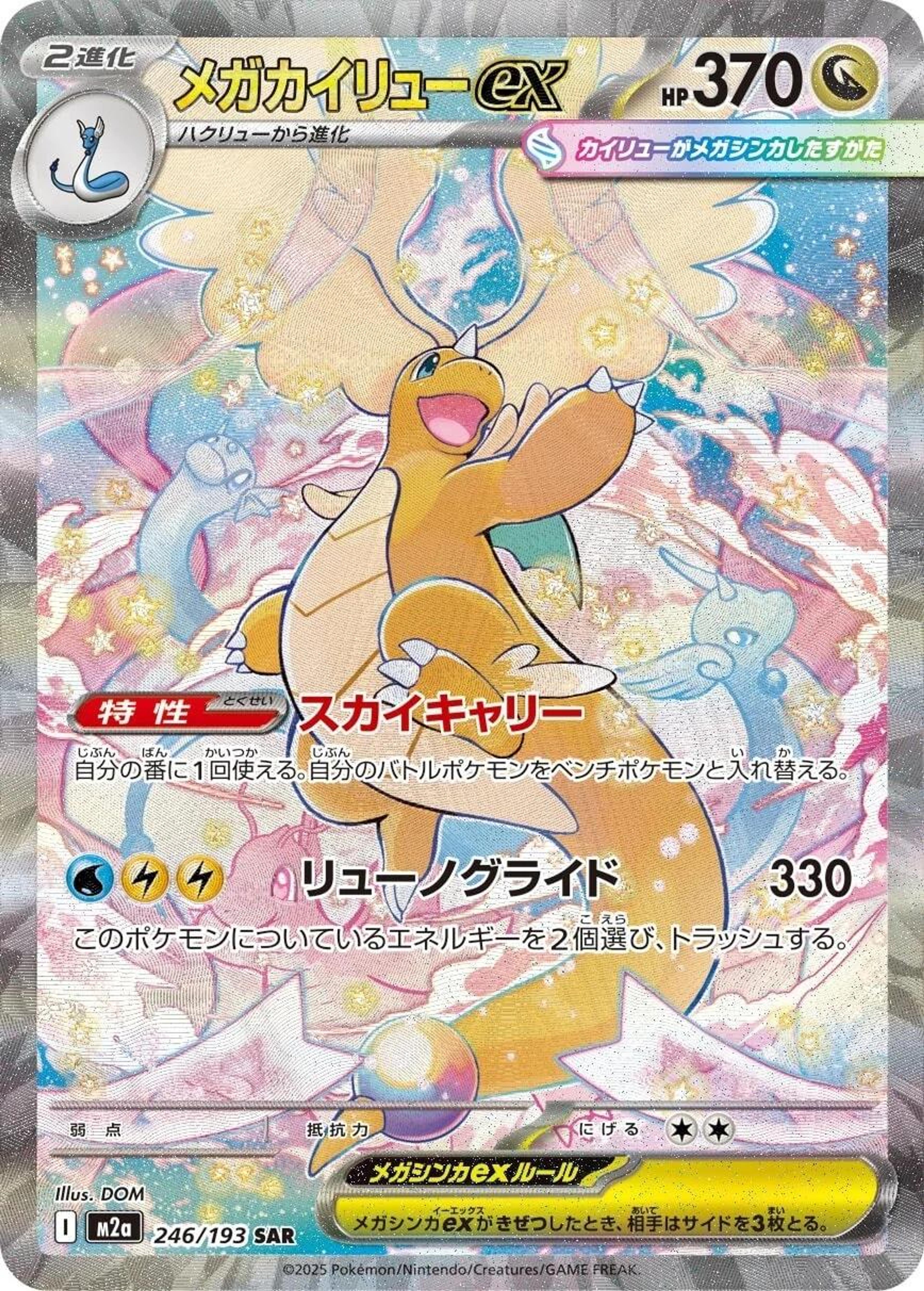
Akira Egawa's Chi-Yu ex and DOM's Mega Dragonite ex both come from Japanese sets, and both push into something closer to painting than illustration. Egawa in torn reds and violets around a beam of light, DOM in pale stars and pastel wings. The Japanese-only status is part of the appeal, but it is not why they are here.
The ones that got there first
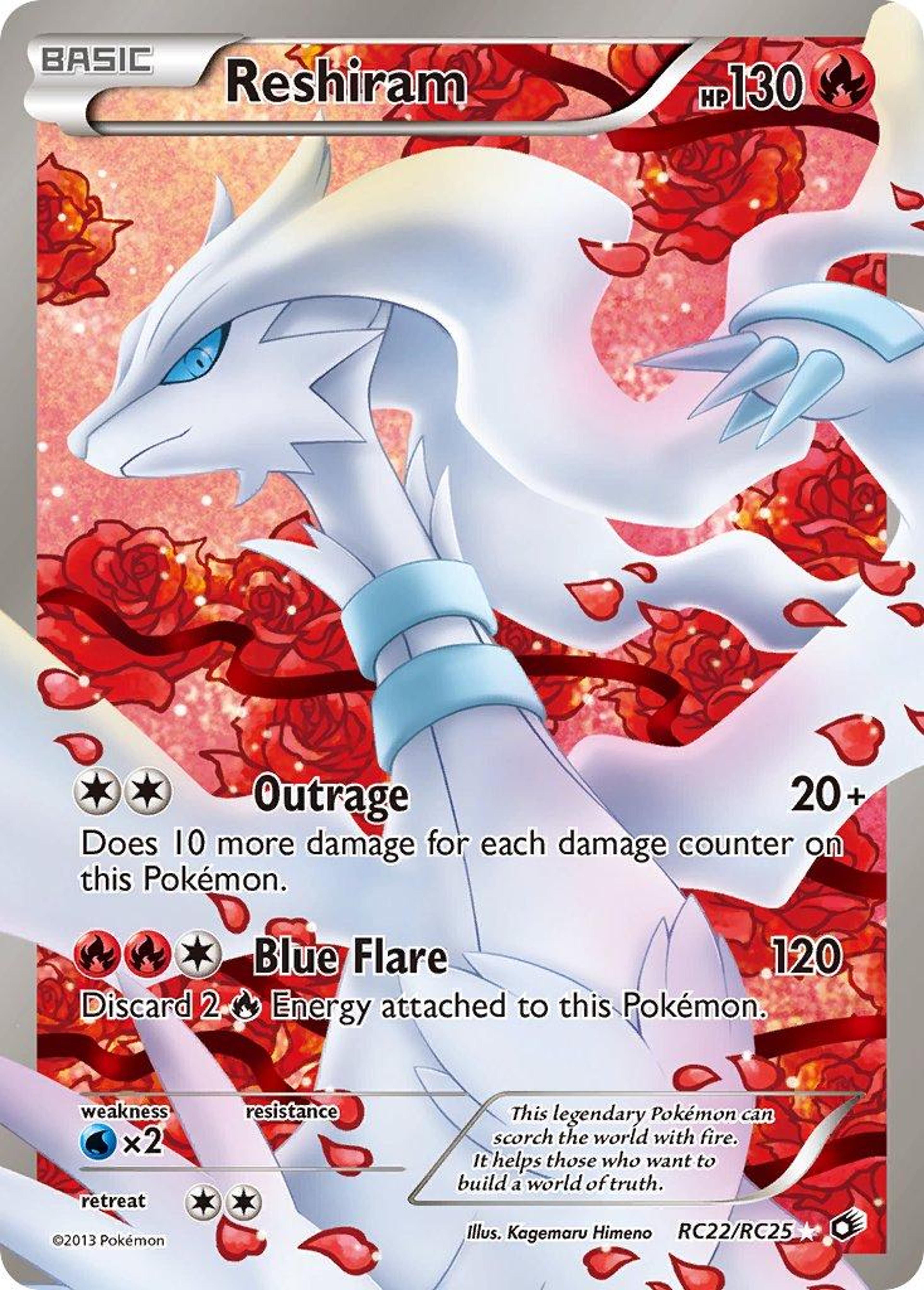
Kagemaru Himeno's Reshiram, from 2013, is a full-art white dragon on red roses and falling petals. Himeno spent a career building cards around atmosphere rather than the creature, and this one is her thesis: the Pokémon is white on white, and the entire card is carried by what surrounds it.
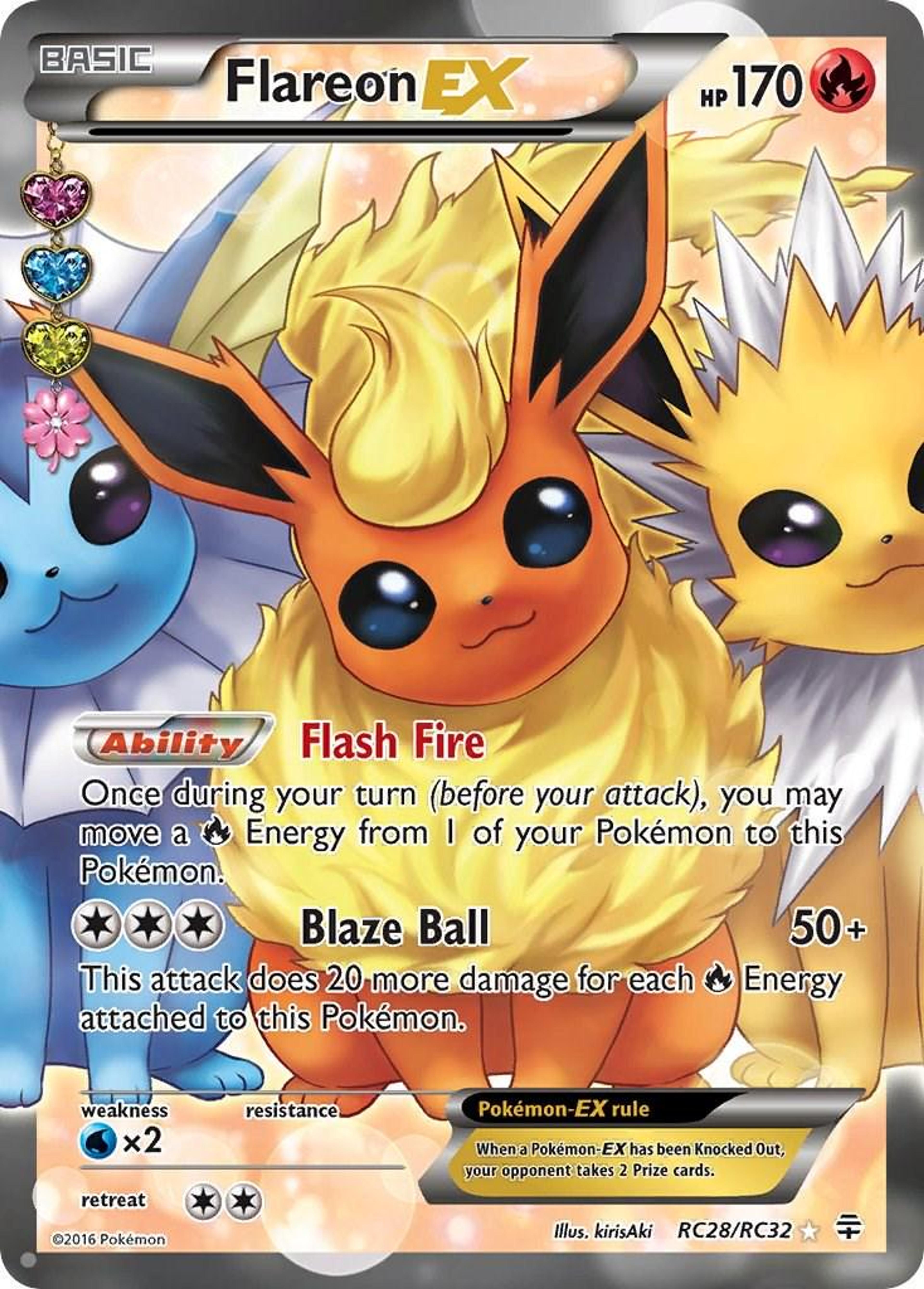
kirisAki's Flareon EX puts Flareon in front with Vaporeon and Jolteon behind, all soft light and enormous eyes, a card that understood the appeal of the Eeveelutions as a family portrait years before that became the default.
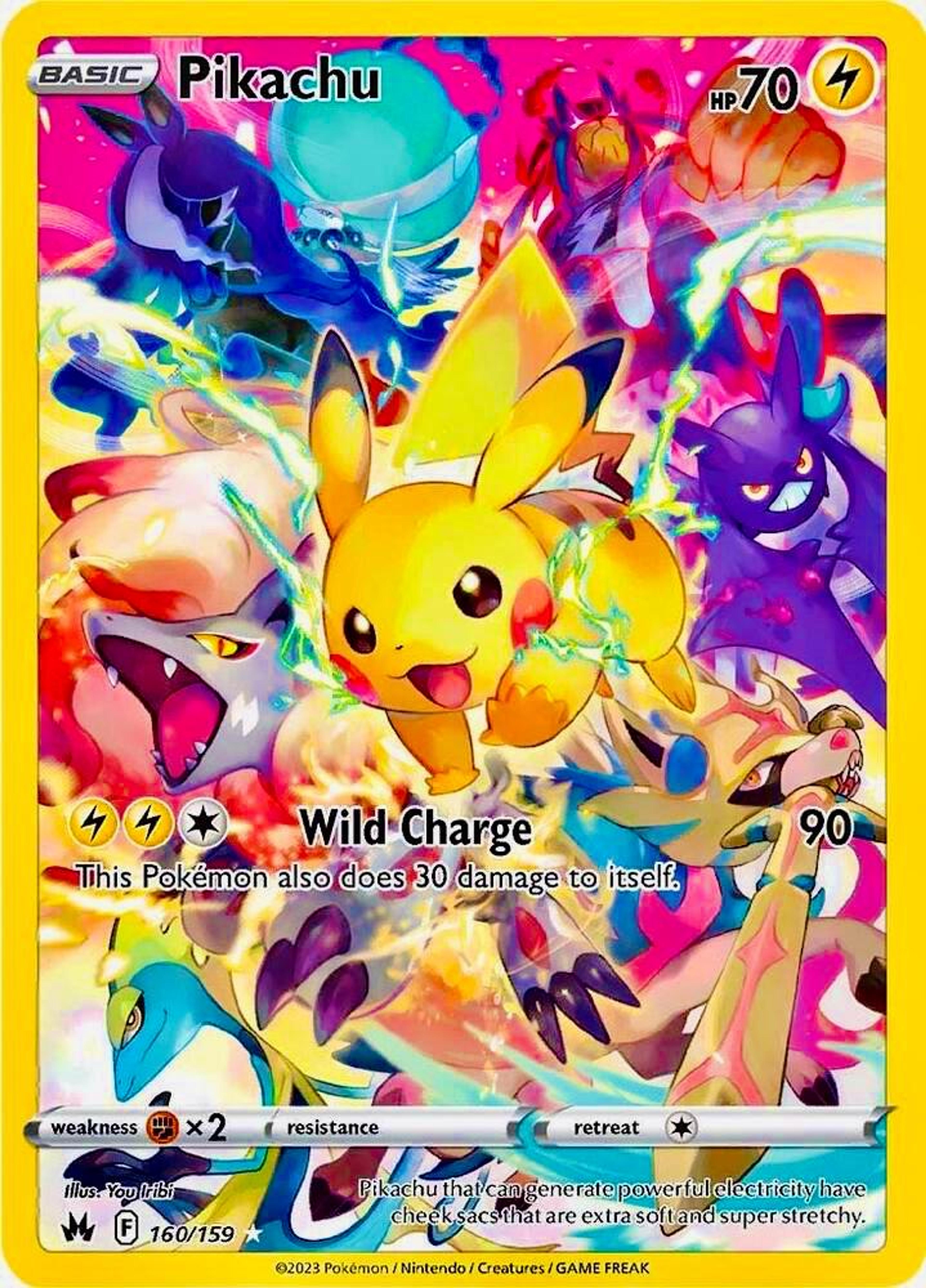
And You Iribi's Pikachu is the ancestor of every card above: Pikachu in the middle, a dozen other Pokémon exploding outward in saturated colour, the whole thing closer to a poster than to a game piece.
What this means for a collection
Cards built on artwork behave differently from cards built on scarcity. They survive format rotations, reprints and power creep, because what people wanted was never the rarity symbol, and the illustration is the one thing on a card that cannot be errata'd.
That does not make them a strategy, and a list of beautiful cards is not a buying signal. But a collection assembled around illustrations tends to be one people actually keep. And the collection you keep is the one worth tracking properly.
If you want the other side of that coin (the cards where the value is in the numbers rather than the picture) read why five ordinary-looking cards still hide serious PSA 10 upside.
Knowing what you own
The practical problem with collecting on taste is that taste scatters. Cards accumulate across sets, languages and years with no common thread except that you liked them, a Japanese SAR here, a 2013 full art there, a promo from a film.
Stakd exists for exactly that: photograph a card, get it identified, see what it is worth today, and watch the whole collection in one place instead of guessing.
More from us on card art and the culture around it.
Track what your collection is really worth
Stakd turns your cards, Funko Pops and LEGO sets into a valued portfolio, with AI grading, live market prices and profit tracking.
Download StakdKeep reading
Card art & culture
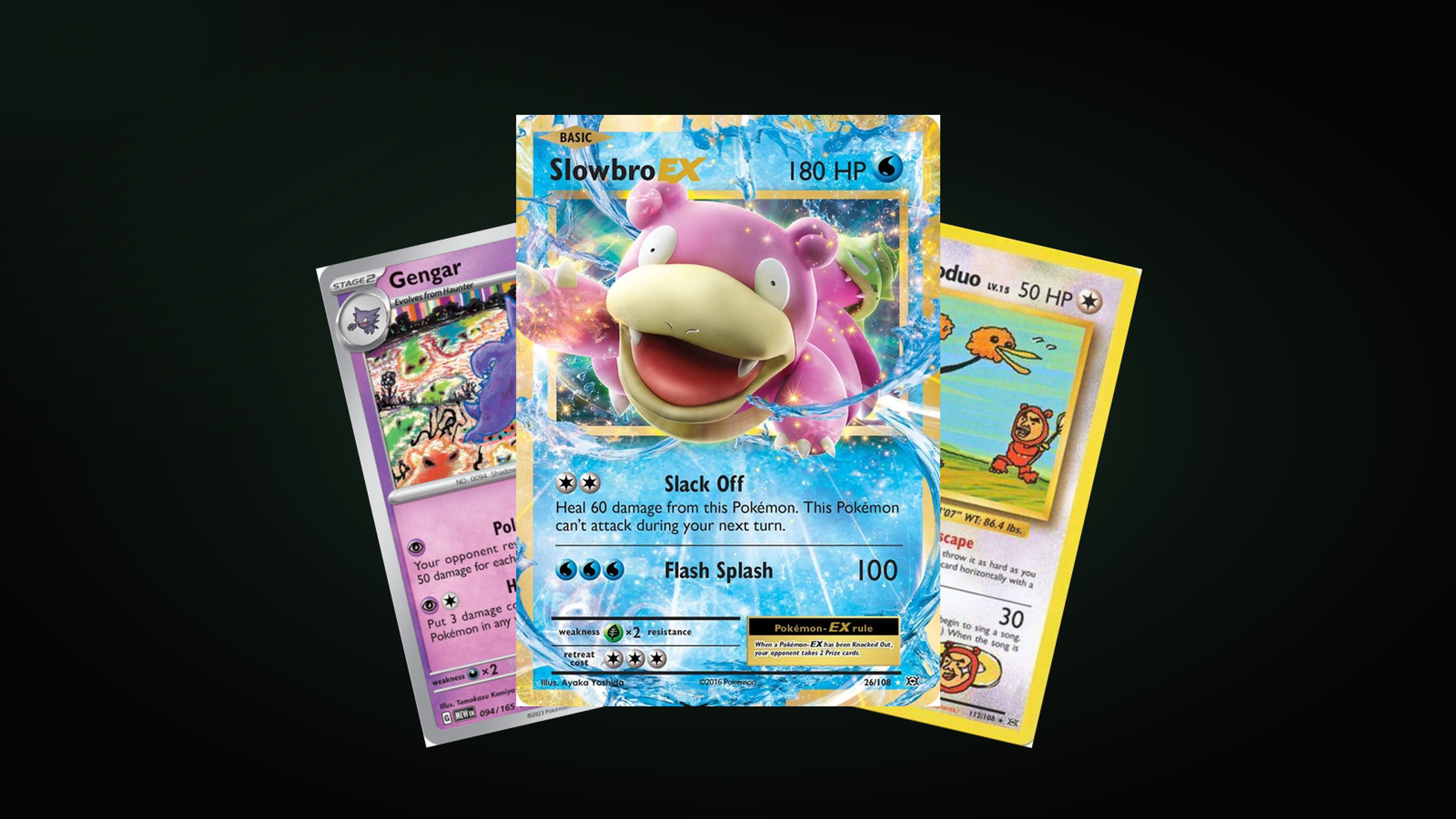
The 15 Goofiest Pokémon Cards of All Time
Fifteen cards that gave up on looking powerful. The same artist keeps appearing, and so do the same three Pokémon families.
· 4 min read
Card art & culture
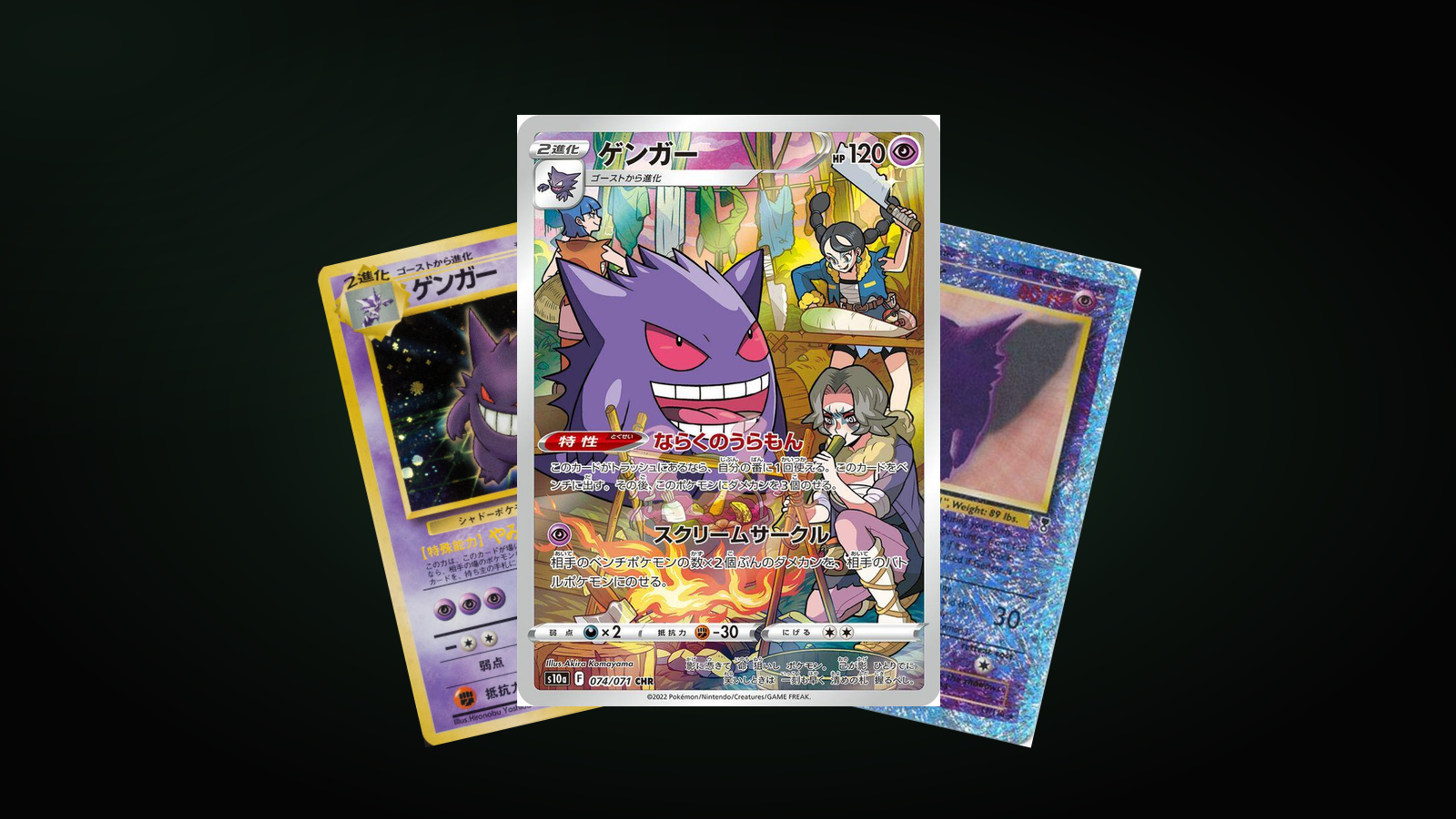
The 10 Most Iconic Gengar Cards of All Time
Thirty years of Gengar, from a Gym-era Sugimori classic to a 2026 Mega, and what each card says about the era that printed it.
· 3 min read
Card art & culture
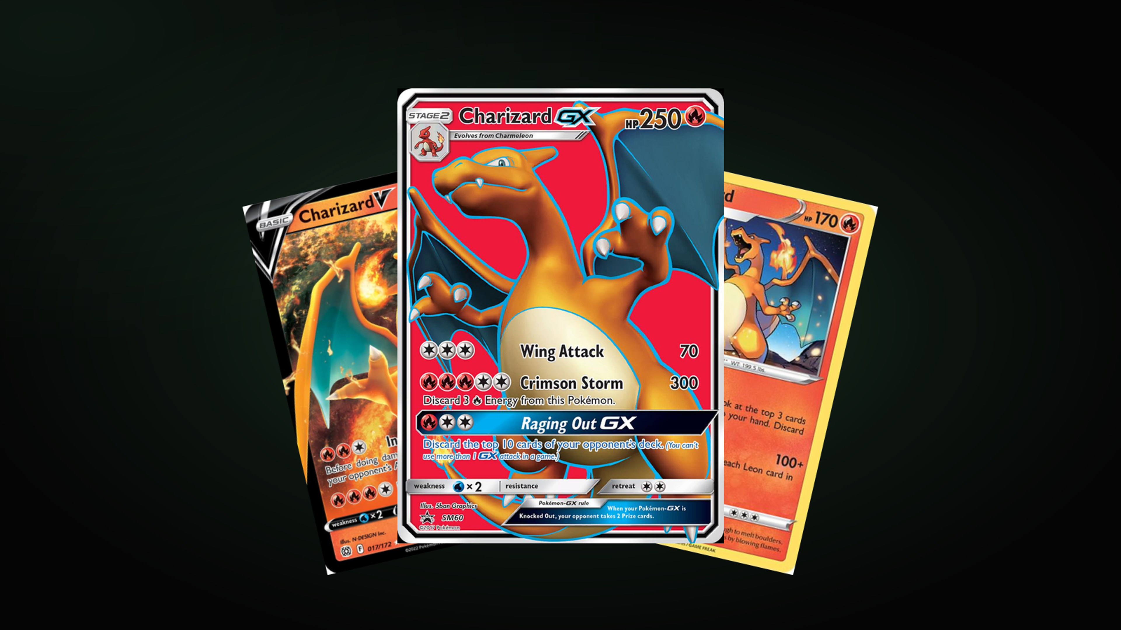
The 10 Ugliest Charizard Cards of All Time
Charizard sells whatever is printed on it, which is exactly why some of the art is this bad. Ten misses, and the house decisions behind them.
· 3 min read